In the realm of dashboards, the famous movie line “If you build it, they will come” doesn’t quite hold water. According to a BARC survey, dashboard adoption struggles at just 20%. But fear not, we’ve pinpointed the 10 mistakes that often sabotage adoption rates. Avoiding these pitfalls is your key to ensuring that when you build it, they will indeed come.
Dashboards are essential instruments that decision-makers rely on to make critical decisions for their business. The user base can be anything from marketing executives to operational managers to even CEOs, who often grapple with high volumes of data or are hindered by time constraints. So, it is imperative that dashboards offer access to essential information to help them make faster, reliable decisions.
The success of a dashboard does not only come from the amount of content in it. In fact, visual appeal and efficiency of comprehension is a significant aspect that makes people want to use them in the first place. Yet, there are several ways where basic data design mistakes can make dashboards less likely to engage the customer or even be useful.
If you’ve built it, why don’t they use it? Here are ten important dashboard design pitfalls that you must avoid!
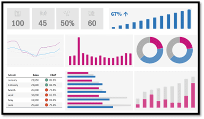
1. Overwhelming data overload
Excessive data points, charts, or KPIs cluttering your dashboards can render them unwieldy and counterproductive. In fact, users often find it challenging to extract meaningful insights when confronted with a large quantity of information.
The main objective is to identify and highlight only the essential data, so that there is clear and immediate access to valuable insights. Prioritization is key here; rather than drowning users in excessive amounts of data, only what is necessary for the dashboard’s effectiveness should be on display.
Power tip: If you design dashboards that you believe will appeal to everyone, chances are they will be used by no one. Identify the internal subject matter experts, the power users of data and shadow stakeholders. Be sure to gather their inputs. In the end, you’ll be happy that you did.
2. Lack of Visual Consistency
Inconsistent fonts, colors, and chart styles can disrupt the overall user experience and impede seamless interpretation of information. To address this, it is important to maintain a consistent visual identity throughout your dashboard.
Ask for the brand style guide. If the business has predefined fonts and color schemes for its communications, then it is advisable to maintain similar styling, so that dashboards are in alignment with the business’s branding and design standards. In addition, you should ensure that chart styles and formatting follow a certain degree of uniformity so that users can navigate and understand the data effortlessly.
Power tip: Design is both a strategic and creative process, seamlessly blending aesthetics and utility to tackle distinct challenges or objectives. Be cautious during requirements gathering; it’s crucial to discern your stakeholders’ actual needs from their initial requests. Avoid the tendency to overdesign. Doing so can swiftly undermine the integrity of the data experience.

The mismatch between users and tool functionality is a primary reason many BI/Analytics licenses remain unused. Moreover, if businesspeople don’t trust the accuracy of data, they simply won’t use BI/analytics tools or their output, tarnishing the program’s reputation and jeopardizing the data leader’s career. Like poor data quality, lack of easy-to-use tools is also a data killer – BARC and Eckerson Group
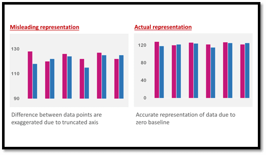
3. Misleading data visualization
Trust is everything. Misrepresenting data through inappropriate visualization can erode the very foundation of data-driven decision-making, often leading to costly errors or misguided conclusions. So, it is important that you select appropriate chart types that align with the nature of the data and ensure that the scaling accurately represents the data’s range and proportions.
Power tip: Many of today’s top-notch visualization platforms streamline widget construction. Nevertheless, the heart of successful visualization lies not in the tool but in your capacity to communicate effectively with your audience. Technology can get in the way of the message.
4. Lack of Context
If you find users asking questions like “What does this data represent?” or “Why is this trend significant?”, it means insufficient context is being provided for the data points and trends on display. You need to acknowledge that not all users are data experts, and that clear, accessible information is essential for effective decision-making.
To mitigate this kind of issue, try and incorporate explanatory text, labels, titles or tooltips within the dashboard design. These simple additions can offer valuable insights and allow users to gain a deeper understanding of the information and significance of the presented data.
5. Disorganized Layout
Effective dashboard design should prioritize organization and visual hierarchy. You might have all the necessary data relevant to user’s needs, but if the charts, tables, text, and images lack organization and some form of visual hierarchy, the chaotic appearance can make it difficult for users to process and extract meaningful insights.
Power tip: While design system-aligned templates can aid in speeding up work, they should never overshadow the importance of audience engagement. There are situations where words convey the message more effectively than visuals.
Focus on structuring the dashboard in a way that guides the user’s attention to the most critical information. Prioritize embracing the concept of white space and declutter the interface. By strategically spacing out elements and removing unnecessary components, not only does the dashboard become visually appealing and easier to navigate, but the readability of it significantly improves as well. Users will have the opportunity to absorb key insights without feeling distracted by the disorganized arrangement.
6. Overuse of Charts
While charts and graphs may be considered powerful tools for data visualization, be wary not to overuse them. Doing so can obscure the core message, whereas opting for a more minimalistic approach can enhance clarity and streamline the communication of key insights. Keep in mind, simplicity in data visualization should be a result of a clear and effective design, rather than being the primary objective itself.
7. Poor Color Choices
Be mindful of color selection. It is a pivotal aspect of dashboard design because inappropriate color combinations can make dashboards unattractive, hard to read or even inaccessible to individuals with color vision deficiencies. To address this, begin by restricting your color palette to a maximum of three distinct hues. If you want a more limited color scheme, use proper shade variations to differentiate specific data points. The key objective is to introduce sufficient contrast and ensure that the dashboard effectively communicates its message to a diverse audience while accommodating those with varying degrees of color perception.
8. Keep boundaries on a single screen
When critical information is spread across multiple screens, users must scroll or navigate between screens and stitch the information together. This can lead to cognitive fatigue, increased likelihood of overlooking crucial data, reduced comprehension and even slowed decision making.
Our minds are optimized for understanding information more effortlessly when it is readily available within our field of view. You should structure dashboard elements in such a way that the key information is visible on a single screen view, facilitating better comparison and decision making for the user. This strategy also aligns with the principle of reducing cognitive load, ensuring that users can quickly grasp the data presented.
9. Displaying non-actionable information
Actionable information is the linchpin of informed decision-making, and therefore a fundamental principle of effective data visualization. Focus on metrics, KPIs and graphs that can drive meaningful actions and decisions and turn dashboards into valuable tools for guiding improvements. Non-actionable KPIs not only clutter and add unnecessary complexity to dashboards, but it can also lead to analysis paralysis, often diverting attention away from crucial issues that need more attention.
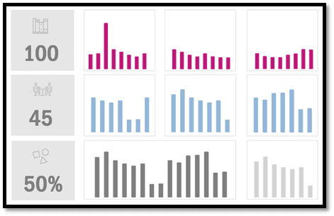
10. Confusing Resemblance
Embracing repetition in visualization elements where appropriate can offer a feel of consistency and familiarity, but there needs to be a thoughtful balance between user’s analytical needs and visual consistency. If you use a uniform design approach throughout the entire dashboard, it can result in visual monotony where elements blend into each other. This can obscure key insights, potentially causing confusion and inhibiting the user’s ability to differentiate critical information.
In conclusion
The essence of an effective dashboard lies in its ability to provide users with the tools required for data-driven decision-making, enabling them to uncover fresh insights within their business data and keep a vigilant eye on critical metrics. To achieve this, you must design the dashboard with the customer in mind so that they can effortlessly bridge the gap between raw data and actionable insights.
But in saying that, do not go overboard either. The concept that a multitude of data and intricate visualizations inherently result in better insights is an absolute myth. Instead, dashboards require a more strategic approach – prioritizing presentation of the right data and choosing the most suitable charts to convey the data’s significance.
As celebrated graphic designer Milton Glaser, very fittingly puts it – “To design is to communicate clearly by whatever means you can control or master.”
About Decision Foundry
Decision Foundry is a Salesforce, independent software vendor, managed services provider, and a certified award-winning Salesforce Marketing Cloud integration partner. Decision Foundry closes the gap between data accessibility, platform adoption and business impact. Our consulting services include the integration of Data Cloud, Account, Engagement, Personalization, Tableau, and Intelligence.


