People don’t talk about Data User Experience or Data UX much these days. This guide examines why it’s important to create great user experience for Business Intelligence (BI) implementation and how to it.
An efficient Business Intelligence system unifies data sets from multiple sources to provide improved visibility into the business. Considerable time and effort is placed on back-end development to make the data fetch, transformation, and flow of information, seamless. This effort is well-placed, but you can stop there.
The data visualization layer can become a place where a lot of information is simply dumped, which can overwhelm the user. Often, we overdo or downplay the primary objective: communicate the value of data to the business in the shortest amount of time with the least amount of friction. Unfortunately, a complicated visualization or dashboard confuses the message. At this point, user disengagement happens, and the dashboard loses its purpose and is quickly shelved. This happens far more than most would admit, but it’s the reality of BI project development.
In short, if we want to increase user adoption, we cannot stop at the back end and accuracy of the numbers. We need to explore what improves the BI data experience and users make better decisions faster.
MAKE IT SIMPLE AND EFFICIENT
In the book “Storytelling with Data”, author Cole Nussbaumer Knaflic talks about “Cognitive Load.” This refers to the importance of reducing the effort needed to read data from the dashboard. The idea is to de clutter the page you build. Too many data points or visuals don’t help user decision. In fact, too many options make it more likely to confused the user. In data visualization, a lot of information gives rise to more choices, which causes a longer time to derive a decision.
The time it takes to decide increase with the number and complexity of choices.
-Hick’s Law
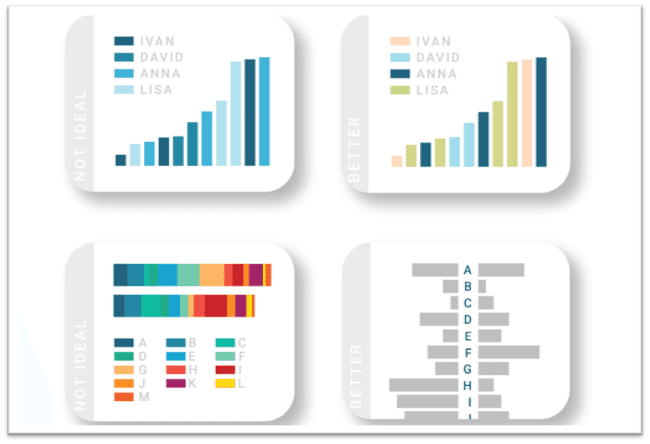
Needlessly complex visualizations are typical. In our competitive world, it’s customary to show off and be different. Most of the time, exploration churns out the most complex visuals, which are hard for the user to understand. Avoid this. he simplest data visualization elicits the best information.
While creativity and aesthetics are essential elements for better UX, simplicity always wins. Unnecessary efforts to create a “wow” moment won’t in the long run. Questions will pop up quickly and user adoption.
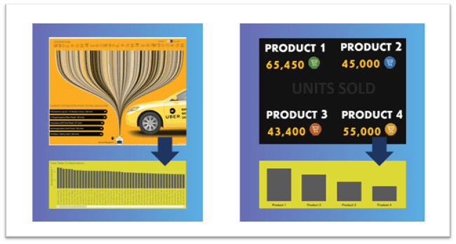
For example, in the charts below, the graph on the left can be simplified by replacing them with the bar chart on the right. Less confusion means more information shared faster.
UNDERSTAND THE PURPOSE AND AUDIENCE
It’s a mistake to set up dashboards without first understanding its audience. Organizations are made up of different people who need to explore data need a different approach than a busy executive.
WHO IS YOUR AUDIENCE?
Start by asking the end-users about details they need. Are they upper-level executives? They need a quick read. Is the audience made up of marketing professionals that need to see every aspect of the campaign? They’ll want more detail. You don’t want users to waste time insights.
Make sure that you know your audience before deciding on the type of dashboards. Start by classifying your dashboard under the below categories. This approach lays out a clear direction for next steps
1. Executive Dashboards
Executive, or high-level, dashboards display quick and critical information. The goal of these dashboards is to present data highlights for fast, efficient insights. Emphasis here is on KPIs, but don’t forget to include context. We’ll discuss context building later on. You don’t need to provide a lot of user controls on an executive dashboard.
Tip: Optimized mobile versions of the dashboard so that the information is always handy for on-the-go executives.
2. Analytical Dashboards
Analytical dashboards need to keep a top-down approach with the important KPIs at the top. The bottom of the dashboard explains the least granularity available within the datasets. Analysts use these dashboards to dive deep into data for decision-making and analysis. The goal is to present essential data points, track trends, and recognize patterns. User controls, drilldowns, and multiple tabs will also help gain useful insights.
Tip: If possible, give web authoring access to create their visuals and dig deeper.
MOD OF DELIVERY
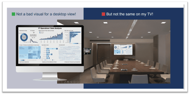
The mode of delivery, or consumption method, brings more options the Executive and Analytical Dashboards. For instance, we can design and build an executive dashboard for a TV display that should be different from standard desktop design. But, the same executive dashboard should be different than one with mobile access. This is separate from the responsiveness of the dashboards we build. The delivery involves different layout selections — from data points to colors to user controls.
Real World Example
Recently, we implemented an innovative BI solution for a leading finance company. All of the dashboards aligned to our data UX principles. We made it easier for users to reach insights with optimized layouts, perfect data visuals, practical tool tips, and drilldowns.
While most of the firm was impressed, a small section of leadership raised a requirement for printing out the executive dashboards for meetings. We had to re-examine the design and optimize them for printing, which made some features more or less useless.
Going forward, we’ve kept a dashboard that compliments this particular option. These were more like the original but loaded with “How to Explore” buttons. According to user stats, we succeeded in migrating the old school users to the new visuals.
the following year, mobile access was made possible through ongoing user adoption programs. This example highlights the need to migrate people from the old to new, while retaining required needs.
A few tips for:
Desktop/Laptop Access
• An ideal number of widgets is five — and never more than ten.
• Follow the optimum layout (discussed this later).
• No more than five user controls. Keep frequently used controls in the right corner ove descending order of importance.
• Use consistent colors for metrics and dimensions.
• Use compatible and consistent fonts and text sizes across the dashboard.
TV Display Dashboard
High transparency: Make sure to review and data points.
• TV dashboards are ideal — plot KPIs with context like percentage growth.
• Use contrasting colors between background and chart elements.
• Include group related information.
• Touchscreens and interactivity are imperative for TV dashboards.
• Always round numbers up.
• Use clear labels and headings.
• Stick to simple widely accepted visuals.
Mobile Access
• The layout must be streamlined, neat, and minimal.
• Display only essential data only .
• Ideally, create an exclusive mobile version.
• Since users will be checking data on the go, they are more likely focused on daily operational data rather than analysis.
• Account for touchscreen, i.e, “fat fingers.”
• Avoid misclicks each widget and visual elements.
• Be consistent in terms of layout, colors, and elements across the app.
• Ensure visual appeal and draw attention to critical elements.
• Contrast your background and foreground colors so that the data points stand out.
GET THE RIGHT TEMPLATE
Most of the topics discussed previously cascade to the template. Our objective is to create presentable and easy-to-understand template et look at some basic rules.
DASHBOARD DESIGN GUIDELINES
RESIDE ON SINGLE SCREEN
Most dashboards are viewed through a browser. Avoid unnecessary scrolling
OPTIMAL USE OF AVAILABLE SPACE
Prioritize your dashboard elements.
GROUP RELATED PIECES OF INFORMATION TOGETHER
Humans perceive items that are physically located next to one another.
SUMMARIZE DATA
User must immediately understand the data being presented and include an overview section.
LESS IS MORE – 5-9 WIDGETS
More than that just becomes clutter and visually distracts the user from intended purpose of the dashboard.
USE THE RIGHT VISUALIZATION
Select appropriate type of visualization that translates exactly what you’re trying to show.
MAKE APPROPRIATE USE OF COLOR
Draw attention and help users understand their data by easily identifying patterns and trends.
MAKE IT INTERACTIVE
Give the user the control of investigating the data seamlessly.
Based on different user experience studies, with the objective of data storytelling, we designed the following layout. We call it the Optimum Layout for Data UX.
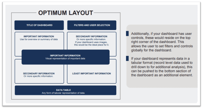
Additionally, if your dashboard has user controls these would reside on the top right corner of the dashboard. This allows the user to set filters and controls globally for the dashboard.
If your dashboard represents data in a tabular format (record level data used to drill down to for additional analysis), this can be pushed to the bottom section of the dashboard as an additional element.
Follow this breakdown, dashboards are divided by the priority of information displayed. The most crucial information should reside on the top left corner. This is the first place the human eye navigates.
Secondary information flows to the top right corner. If your dashboard uses images or graphics, these should be placed here.
The least important information resides in the bottom right corner.
Remember, the size of the dashboard affects the size of each section. Additionally, if your dashboard has user controls, these would reside on the top right corner of the dashboard. This allows the user to set filters and controls globally for the dashboard.
If your dashboard represents data in a tabular format (record level data used to drill down) for additional analysis, this can be pushed to the bottom section of the dashboard as an extra element.
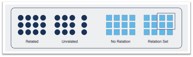
Group related pieces of information together
The law of proximity states that humans perceive objects that reside next to one another as a group. Items that are separated or distant are perceived as unrelated.
Viewing dashboards is a visual task so it’s vital to users accurately view the dashboard.
Discovery sessions with end consumers or representatives are a must to understand their business challenge. A approach may not work all scenarios. A continuous discussion with input from the project owners from the users’ side is needed. Detail is what matters. Discuss all the topics — from the audience type to the type of charts. The more detailed information, the more accurate the selection of KPIs and/or business logic.
Capture requirements
Discovery sessions with end consumers or representatives are a must to understand their business challenge. A approach may not work all scenarios. A continuous discussion with input from the project owners from the users’ side is needed. Detail is what matters. Discuss all the topics — from the audience type to the type of charts. The more detailed information, the more accurate the selection of KPIs and/or business logic.
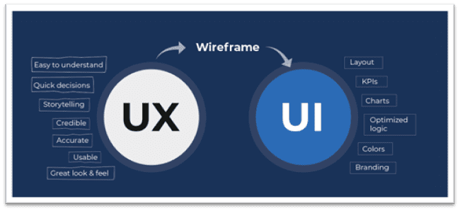
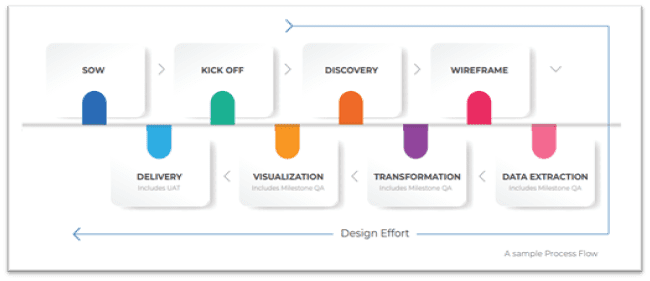
IMPORTANCE OF WIREFRAMES
Wireframes are basic screenshots, sketches, skeleton of your dashboard. It displays the elements of the dashboard and its layout. Wireframes acts as a bridge between UX and UI. UX is what consumers experience, and UI is how you will achieve it. For the same reason, a wireframe is an essential part of the setup of data visualization or business intelligence. And it makes life easier. It is easier to do 10 sketches than a couple of changes to an original dashboard.
Start your wireframes as a rough sketch, and then create a digital mock-up. There may be several versions of your wireframe, with each one making improvements based on feedback. Wireframes are a part of our client deliverables so make sure you
get confirmation on the final draft of the Wireframe before building the dashboard.
You can create a mock-up of the dashboard using something as simple as PowerPoint
online tools available.
GET THE RIGHT VISUALIZATION
We can’t stress enough the importance of using the correct visualization. An incorrect chart type can destroy interpretation. It is essential to understand what information you want to convey and choose visualization that does. Follow the chart below to pick a visual that suits your purpose. Always remember to pick the simplest from the available options.
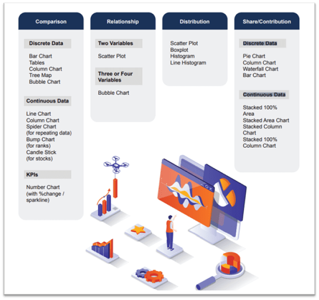
There are a lot of options to represent our data sets. But as we are committed to simplifying data storytelling, we should pick the most user-friendly. A few more examples are given below, which are not commonly used but, are good to try.
Number Charts
Use numbers to display an overall KPI in the at-a-glance dashboard. Numbers are the quickest to read make sure users are not distracted by too many. Use the trend indicator to compare numbers from the same period. For example, if you are displaying numbers for the quarter, the trend indicator should show a percentage change from last quarter or similar period.
Tree Map
Tree Maps are ideal for representing categorical data. The chart can carry two measures: one with the size of the boxes and the other with the color intensity. Opt for a Tree Map when we want to show a larger population along with the top performers.
Calendar Chart
This chart is ideal for plotting metrics across calendar days and identify patterns. The metric will be represented by color dips and spikes will be presented by the intensity.
Bump Chart
A bump chart is a variant of line chart. It’s ideal for representing changes in ranks
across categories. Instead of plotting the metric directly to this chart, we derive the rank from the intended metric, and plot the same on the chart.
Sunburst Chart
Sunburst charts usually display hierarchical data in which ring represents each level of data. The outer-most ring represents the data that is on the top of the order. The charts
work best with three or more levels of hierarchy, but no more than six with one metric.
Waffle Chart
A waffle chart, or a square pie chart, is used to represent a positive percentage. Since it does not use angles like a pie chart, it is easier to identify differences between dimensions, especially when values are closer
Heat Map
A heat map is a tabular chart variant. While as color gradient helps depict the increase of metric, a heat map makes it easier for the reader to understand the pattern.
Tip: Explore www.makaw.io for more charts and templates. Makaw is a marketplace and gallery of free, downloadable, data visualization templates, charts, and dashboards for Tableau, Power BI, Datorama, Alteryx, and more.
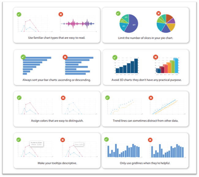
DOs AND DON’Ts WHILE SETTING UP VISUALS
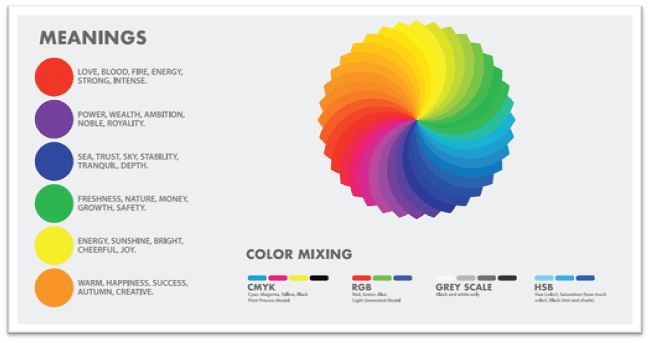
IMPORTANCE OF COLORS
Colors simplify complex graphs with lines and heat maps visual clutter that isn’t immediately intuitive. Comparing even moderate amounts of data can be draining but, by using contrasting colors, you can simplify things to help viewers see the big picture. For example, try blue and orange for visualizations that compare two data sets, or a gradient of colors to represent a scale.
The colors you choose are highly dependent on how you’re trying to make your viewers feel. Colors can convey a sense of calmness or give a festive air. They may even evoke complex feelings such as sophistication, purity, and creativity. Using the right colors can get your viewers to feel how you want them to think about their data.
Colors also add depth to data. Using the same colors for everything in your visualization isn’t just confusing, it’s also terribly dull. Make use of contrasting colors, gradients, and other exciting color combinations to make your graphs jump out of presentations grab viewers’ attention, and show deeper meaning. Want to emphasize a piece of data in your bar graph? Give it a splash of red in a sea of gray.
Emotions in Colors
Color psychology can help you decide what to pick for branding your dashboard. These colors define the overall mood of the dashboard. Colors invoke emotions and can be highly effective if done right.
DOs and DON’Ts OF COLOR
Don’t use a gradient color palette for categories or the other way round. Colors make it easier for users to distinguish between varieties. Use solid colors in your charts to represent categorical data, and gradients to depict the range of numerical data.
If you use more than five colors in a single graph, change the type of graph. More colors make it difficult for users to distinguish between the dimensions. You should avoid making the user refer to a color legend too often.
Use the same colors to represent the same variables throughout the dashboard. However, if you’re using multiple colors for multiple variables, you should be consistent across the dashboard. Colors are a great way of avoiding confusion.
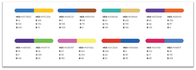
CONSIDER COLOR BLINDNESS
Color blindness affects many people and can become a severe disadvantage for data representation with color.
Use different lightness in your gradients and color palettes to provide readers with a color vision deficiency the ability to distinguish your colors. Here are a few palettes that maintain their contrast for colorblind users.
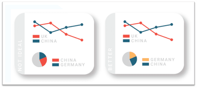
POWER OF CONTEXT
Though we have previously discussed the importance of context, it deserves a deeper
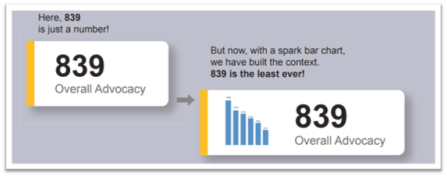
evaluation. We believe all data representation should have proper context. A revenue number alone is information, but the exact number with a Sparkline, or a previous period percentage change, offers insights.
Context can be built with third-party data, like industry averages, and be shown as a reference in the visual. You can also derive benchmarks with sophisticated methods and plot them on the data. This is makes it very easy for users to find insights.
EMBRACE ADVANCE ANALYTICS
Integrated data science is essential for business intelligence. Predictive elements inside deliveries makes the process complex but easier for the user to understand the data and make accurate decisions. But it’s not always about having complex models. Simple data science components integrated into visuals make them more meaningful.
We always look for opportunities to solve data issues with statistical methods even if it is complex. For example, use of control lines from standard deviation and mean could be a simple way to track anomalies, spikes, or drops in a trend. Reference points or context building using averages, median, mode, or trend lines can also be solid additions. Use visuals, like box plot or scatter, to display the distributions.
A few more questions worth asking:
• Can we analyze data using clustering?
• Can we perform predictive analytics with forecasting?
• Can we see changes over time using control charts?
• Can we analyze relations in data using correlation matrices?
• Can we visualize and explore patterns in your data?
• Can we check on third-party (external) connections to run models and visualize the output?
• Can we connect to the analytical programming languages (R, Python, MATLAB, etc.)?
MAKE ACCESS TO DATA EASY & QUICK
Easy & Quick motivates us to find innovative methods to represent data and tell a story. Below are some of the ways to reduce the distance between the end users and data.
Alerts
Initially, alerts are not always set up ut, it’s an excellent practice to keep clients informed of KPI performance updates. As the title of this section says, access to information should be as easy as possible. Again, it is essential to understand clients’ KPIs and the expected state — decrease or increase. The alert threshold should be set based on this information.
Tip: The client may not necessarily ask for this but ensure that you are proactive and bring it up to their notice in the discussions.
Mobile Access
Another vital aspect of dashboard is its mobile device compatibility. As data consultants, we are worried about the responsive design of your dashboard tech stack, and how easy and quick it is to capture on a smaller screen. Responsive screens are readily available, but be mindful of the information that is displayed on a mobile version.
DESIGNER’S TOUCH
The addition of a bunch of designers is not normal for an analytics team. But, it’s a gamechanger for the user experience. Identify people who are keen on design and want to volunteer.
A designer’s input in color and template design adds a lot of value to storytelling. Also, rather than making the designer’s phase a milestone in the implementation process, we recommend making it a parallel effort from the discovery stage.
INCLUDE A PLAYBOOK
The objective of business intelligence is to effectively visualize data sets. Data storytelling is more effective when users read the dashboards as intended. Yes, we want to keep the visuals simple to understand. But we don’t deny the fact that often times, with a massive list of requirements, our BI layers can be overwhelming.
Interactive charts without proper guidelines miss hidden stories. With this context, we suggest a playbook, or user manual. The playbook is a must for all user interfaces we built. It can be an easy-to-read PDF or an HTML page with relevant screenshots and, preferably, gifs. The manual could be a video, too. But make sure the materials are linked with an info button on the dashboard to make it usable.
About Decision Foundry
Decision Foundry is a Salesforce, independent software vendor, managed services provider, and a certified award-winning Salesforce Marketing Cloud integration partner. Decision Foundry closes the gap between data accessibility, platform adoption and business impact. Our consulting services include the integration of Data Cloud, Account, Engagement, Personalization, Tableau, and Intelligence.


