When talking about improving business decisions, one of the most frequently asked questions posed by marketers is how to compare change/growth in revenue, media cost, and other main KPIs, over time.
While reports, presentations, and functional dashboards can reveal quite a bit, challenges can arise when marketers need to quickly pivot and compare data across timeframes. How does one metric change/compare when we simply change the date range? Let’s consider Media Spend. It’s good practice to show last year’s media spend (YOY) but, depending on the use case, it’s also helpful to demonstrate month-on-month comparisons, weekly, custom date ranges, or even running averages! The fundamental aspects of time comparison are critical to analysis, so let’s talk about the benefits Datorama Salesforce can provide out of the box, as well as custom.
In Datorama Salesforce, a time comparison widget can highlight the previous value metric and percentage growth or decline in a specified KPI. Let’s start with the basics
To create a time comparison in Datorama Salesforce, we first need to understand how it’s implemented in two ways. The (1) first enables the time comparison within an existing widget, such as a status bar or table. (2) For the second way, we need to create a new time comparison widget and choose the required type. Currently, the available options include a bar chart, bi-dimensional bar chart, status bar, or table but there are additional customizations possible when using custom widgets and custom calculations. More on this later. Follow the tutorial for adding a time comparison bar chart to a Datorama dashboard.
- Login to the Datorama platform
- Hit the Visualization tab in the top navbar
- Navigate to the dashboard page that you want to add a widget to
- Click the pencil icon, and then click the + icon to add a widget
- Scroll to the time-comparison bidimensional bar
- Add the two measurements that you want to compare
- Don’t forget to add the dimensions that you want or Datorama will throw an error
- and Voila!There you go!
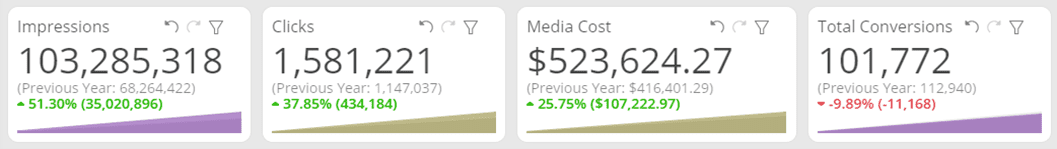
Time Comparison Status Bar
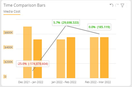
Time Comparison Bars
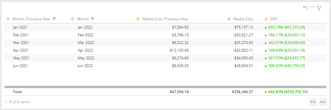
Time Comparison Table
Now, the widgets have comparison types fixed in the setup. This long process is time-consuming and not user-friendly.
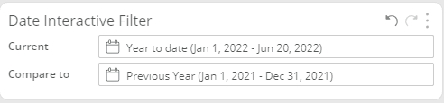
Here is where date interactive filter comes to rescue. This widget can be created on a Datorama Salesforce dashboard page where users click the “Compare to” option and quickly shuffle between various comparison types. As mentioned, these types include the previous year, quarter, month, year-to-date, last seven days, and many more.
Another unique feature is the ability to select a custom date range. Here, users can compare specific time frames such as quarter ends and peak seasons, like a Black Friday Sale.
Watch the video below for a step-by-step tutorial on the wide array of comparison options available in Datorama Salesforce.
These two features make comparing KPIs easier than ever. Now, you can look at trends and anomalies from various date ranges and take significant business decisions promptly and effectively on time.
Finally, the out of the box visualizations for the time-comparison widgets isn’t very appealing, but once again, Datorama provides flexibility. Try combining a custom widget with the custom time comparison calculation to deliver a truly memorable data experience.
About Decision Foundry
Decision Foundry is a Salesforce, independent software vendor, managed services provider, and a certified award-winning Salesforce Marketing Cloud integration partner. Decision Foundry closes the gap between data accessibility, platform adoption and business impact. Our consulting services include the integration of Data Cloud, Account, Engagement, Personalization, Tableau, and Intelligence.


