A recent client of ours needed Datorama Custom Visuals mapping of Canada at a Forward Sortation Area (FSA) level. An FSA is a way to designate a geographical unit based on the first three characters in a postal code. The users needed to filter for a given zone and see the FSAs associated with it in a specific color, according to the value of the metric selected. But, Datorama’s built-in map visual for Canada only goes to the province level, which wasn’t sufficient. How did we meet this challenge? Let’s take a look.
The only way forward was to build a custom map visual that goes up to the FSA level. We used High Charts because there weren’t any existing projects with data at an FSA level. As a result, we had to start from scratch. We began by getting the Geo JSON file. Geo JSON is a format for encoding a variety of geographic data structures. In this case, the file contained coordinates for each of the FSAs needed. But there was a problem, the file was too large: 250MB.
Roadblock: All this data cannot be fed to the Datorama Custom Widget because the data would failed to load. We also couldn’t bring in the data through an endpoint because each time the page is opened, 250MB worth of data would have to be downloaded before Datorama can start displaying the visual, again.
Workaround: We decided to only take the FSAs required by the client, which made the file considerably smaller, and then, we pasted the JSON data into the custom widget directly. Unfortunately, this resulted in another issue.
Roadblock: The default state, where no zone was filtered, was supposed to show the map of Canada, but now only a scattered map of discrete areas would display. This is because most of the FSAs required to build the map of Canada were not present.
Workaround: To remedy this, we built another Datorama Custom Visual map at a province level, and added a condition to the custom widget. If a user filters for more than one zone or if the user doesn’t filter for any zone, the data would be shown at a province level with the whole Canada map. If the user filtered for only one Zone, then the data would be shown at an FSA level.
The Final Datorama Custom Visual Output
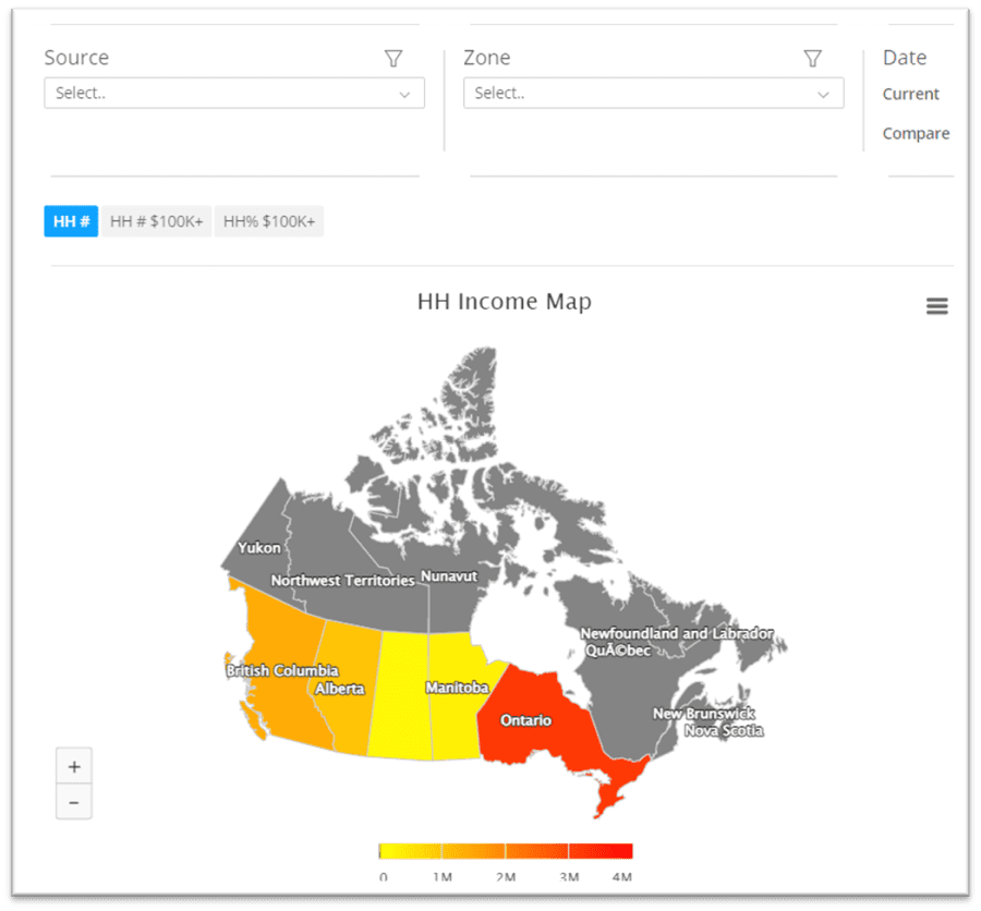
The Datorama Custom Visual map at a province level when no Zone is selected:
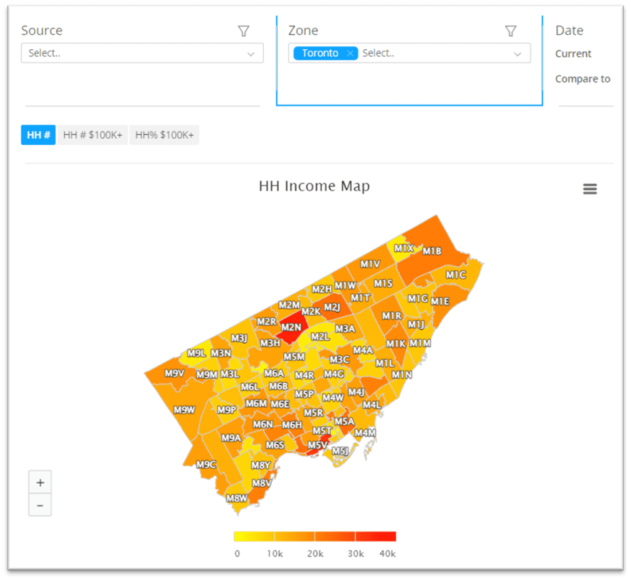
The map at an FSA level when a Zone is selected:
The map changes according to the metric selected by the user. This is because the filter values are now accessible in the custom widget. The actual value of the metric is shown when the user hovers over the area in question.
The color gradient can be changed according to the requirements of the client. In this case, the client wanted Red to indicate high values and Yellow to indicate low values. Therefore, we set the “maxcolor” as Red and the “mincolor” as Yellow. We also changed the way the values were displayed, added currency symbols, and even formatted numbers.
With these workarounds in place, and some outside-the-box thinking, we were able to create the Datorama Custom Visuals map required.
About Decision Foundry
Decision Foundry is a Salesforce, independent software vendor, managed services provider, and a certified award-winning Salesforce Marketing Cloud integration partner. Decision Foundry closes the gap between data accessibility, platform adoption and business impact. Our consulting services include the integration of Data Cloud, Account, Engagement, Personalization, Tableau, and Intelligence.


