Is your goal to achieve a 40% awareness? Have you reached 100% of your weekly spend? How close are you to maximizing your quarterly audience reach? Datorama provides an out-of-the box and highly customized Datorama visualization widgets to help you better manage your campaign efforts and get you to goal.
To accomplish this in Datorama, a common visualization approach can be achieved through the use of Pacing Charts.
What’s a Pacing Chart?
Pacing charts are used to normalize progress-to-goal visualizations across specified KPIs. They can be used in combination with benchmarking metrics but, are most useful for providing like-to-like goal comparisons between KPIs of different categories such as revenue and spend.
Pacing Charts are also a great way to track how much a client’s planned spend tracks to the actuals.
This is a common use case for agencies but works well for advertisers, too. When Pacing Charts are successfully blended with client goals, this can become an extremely useful budget planning tool.
How are pacing charts created in Datorama, now called Marketing Intelligence?
To create Pacing Carts, all we need is a basic Excel file with Goal values broken down by Channel, Week, etc. The granularity can be at any level you require and can be extracted from existing channels. Then, we add this file to Datorama and “pace it out,” according to the dates provided.
To do this, we need to specify the start and end dates, or the start date and the period by which to pace. This can include the week or month. Datorama takes the Goal values provided in the Excel file and spreads them out over the given date range.
The goal file can be an Excel file with Start Date, End Date, and the Budget:
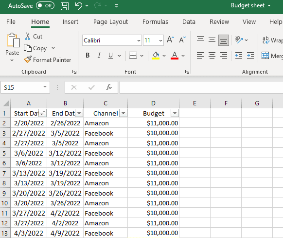
The Channel (or other breakdowns) is an optional field to have, but we highly recommend it.
We can add this file into Datorama as a TotalConnect data stream and map it as mentioned earlier.
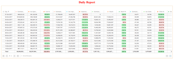
Next, we add these metrics with variance and difference calculations to provide overall insight into how much is being spent. Actual Spend is determined from channel expenditures.
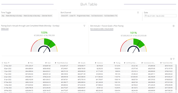
Combining these charts with Goals and filters gives you even more detail and flexibility. Here is where the pacing feature really blossoms. Pro tip: We can use the Time Toggle to switch between time periods. And because we have used the pacing feature, we are able to view the goals over the Day, Week, or Month.
The Goal file is then entered into a Google sheet, OneDrive, or another platform that can be connected to Datorama. This makes it very easy to update goals as required and see the changes within the Pacing Widgets.
Pro tip: Actuals + Future Goals Pacing is another incredibly valuable feature. This metric combines the spend from a specified date with future goals. Actuals + Future Goals Pacing is a much accurate measurement of overall performance. From this we can learn exactly how much will be spent at the anticipated Goal levels.
But why stop at Spend? We can then apply this to almost any goal metric and view how a channel, campaign, or platform, is performing towards a goal:
If required, we can also create a single chart with all Goal values and set targets for a wide range of metrics:
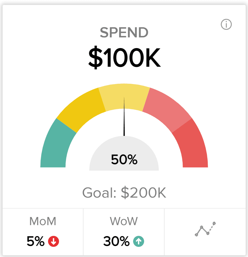
Finally, out of the box pacing and goal widgets can be clunky. Fortunately, Datorama has Data Canvas, so we can turn standard widgets to custom Goal Cards, like this:
Show me how this looks in Datorama
Helping Your Business Get-to-Goal with Visual Communication
Marketing Cloud Intelligence offers a wealth of widgets to start from, but to tailor your visuals around your business objectives can take work, if you want to drive customer value and adoption. Analytically driven marketers can accomplish quite a bit through data and platforms, but with a little more focus around Data Communication over Data Visualization and reports, you just might help your business get-to-goal.
Decision Foundry is a Salesforce, independent software vendor, managed services provider, and a certified award-winning Salesforce Marketing Cloud integration partner. Decision Foundry closes the gap between data accessibility, platform adoption and business impact. Our consulting services include the integration of Data Cloud, Account, Engagement, Personalization, Tableau, and Intelligence.


