In the world of user experience (UX) design, few examples are as universally praised as the instructional booklets produced by IKEA. This may come as a surprise, but IKEA is renowned for their straightforwardness, clarity, and simplicity, and if you study these manuals carefully, you’ll find that they offer some valuable tips for successfully developing dashboards.
“By placing the user at the center and prioritizing their understanding, exploration, and engagement, data-driven products and services can break down barriers, making data analysis and interpretation an intuitive and enriching experience for a broader array of audiences. The challenge for dashboard developers is that this can feel academic and impractical. What’s missing is the how-to guide.”
Just as IKEA’s designers prioritize creating easy-to-follow user-friendly manuals, data-driven products and services must also focus on user empathy and engagement. We call this approach DataUx™, the missing guide for delivering a better data experience using principles of UI/UX research and interaction design to drive adoption and value.
Dashboard development and data design concepts are notoriously the same throughout and although design conventions are known, they are unevenly applied to projects. There are three significant design principles used in IKEA manuals that can serve as a perfect source of inspiration & ideas for designing data applications with purpose and clarity. Let’s see what they are.
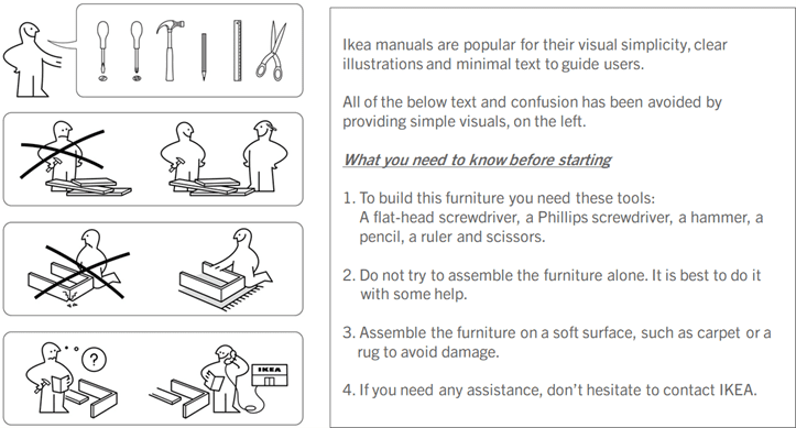
1. Clear and Simple Visuals
IKEA’s design philosophy centers around simplicity and minimalism. You’ll notice how their manuals put a huge emphasis on providing only the necessary information and steps required for assembly. This eliminates confusion and helps users follow along easily. Look at the current trends in dashboard development. It is the opposite. The work is pages long and widget-cramped.
In the context of data, this principle can be successfully applied to create a clean and simple interface that can greatly improve the user’s ability to interpret and engage with the information presented. This is the essence of good Information Design. Minimalistic design principles, consistent color schemes, and appropriate typography can be used to create an intuitive data visualization environment that users can quickly understand.

2. Hierarchy of Information Design
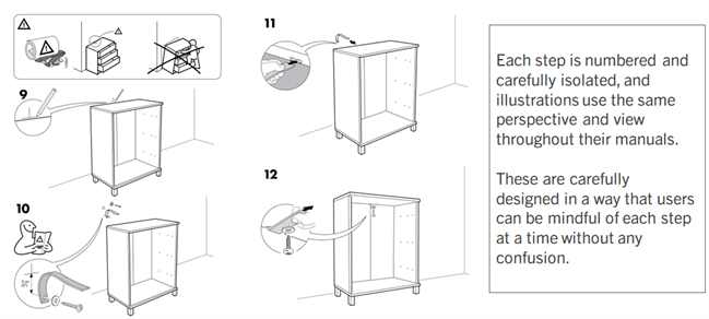
Why is assembling IKEA furniture so much fun? (well, for most people). It’s because they are incredibly user-friendly. They really do a great job of putting strong emphasis on steps to be followed, which eliminates confusion, and ensures that users know what to focus on at each stage. When the user invests the time in following the steps and taking actions, value is created, and we feel emotionally invested when the table you’ve built stands tall and reflects both the instructions and that ideal, mental picture. A proper guide can build confidence when designed correctly.
Similarly, in DataUx™, establishing a well-defined information architecture is critical. This may involve organizing visuals into logical categories, such as prioritizing information based on its relevance and context, or even defining relationships between specific elements where necessary. A well-structured information architecture always helps improve the user’s ability to find and comprehend the data they need. Consider DataUx™ as the virtual coach providing instructions for what to do next.
And don’t just stop there. Try to provide users with guided workflows. When working with complex interfaces, users can always benefit from step-by-step instructions that guide them through the process of analyzing, filtering, and interpreting the information. Perhaps include interactive tooltips, walkthroughs, and tutorials as well. This will help users achieve specific data-related tasks much more efficiently.

3. Consistency and Familiarity
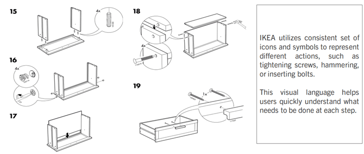
Put a bunch of furniture assembly instruction booklets side-by-side, and we bet you’ll be able to identify IKEA’s immediately. That’s because IKEA sets themselves apart with unique iconography. Simplicity is key for them, so you’ll see them use a few consistent sets of icons and symbols across their booklets. This not only fosters familiarity, but the simple and important visual language breaks down barriers and helps users quickly understand and process what needs to be done at each step.
DataUx™ should similarly maintain a consistent design language across visual representations. Just like IKEA, simplification of complex ideas should be the goal, so that difficult concepts and attributes can be understood efficiently, later. Make navigation seamless for end users and make it easy for them to recognize patterns, trends and outliers without having to dive into intricate textual explanations.

In Conclusion
IKEA manuals have set a benchmark for user-friendly design, and their design principles provide a model that can be seamlessly applied to the domain of DataUx™ and dashboard development.
Incorporating these principles from IKEA’s user-centric approach can revolutionize how users interact with data. It takes practice and patience, but our short portfolio demonstrates how this framework can be applied to dashboard development.
About Decision Foundry
Decision Foundry is a Salesforce, independent software vendor, managed services provider, and a certified award-winning Salesforce Marketing Cloud integration partner. Decision Foundry closes the gap between data accessibility, platform adoption and business impact. Our consulting services include the integration of Data Cloud, Account, Engagement, Personalization, Tableau, and Intelligence.


