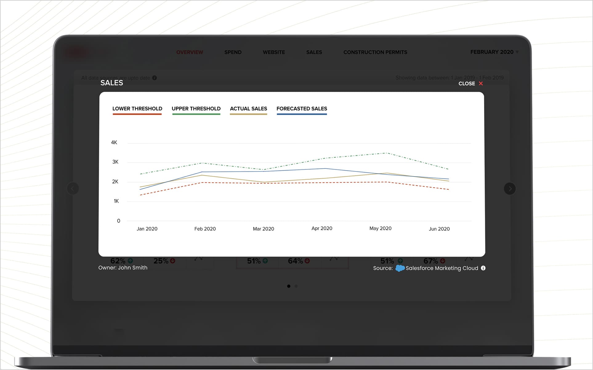
Data can be complex, overwhelming, and perhaps for some clients, even tedious.
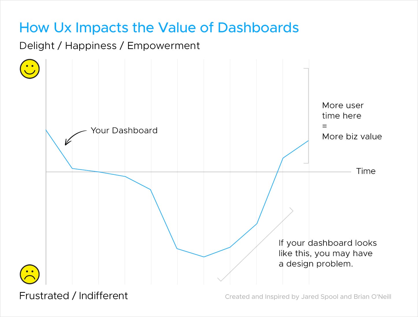
Data evangelists have it right: dry charts won’t cut it. But are we truly answering the call? As adoption drags its feet and audiences drift away, we’re missing a beat. Data should stir souls, not just tick boxes. Data Storytelling may be a part of the solution, but it isn’t a mere academic concept; it’s a proven method to ensure clarity and swift decision-making.
By building an emotional bridge, we ensure clients don’t just see data; they feel its impact through the experience — We give them a reason to care.

The Demand for More Intelligence
According to Fortune Business Insights, the global Business Intelligence market has expanded from $27 billion in 2022 and is projected to reach $54 billion in 2030. Global spending is likely to accelerate through the continued use of Augmented Intelligence, but Business Intelligence adoption rates stand at 20% according to BARC. Why are platform adoption rates so poor and what is the disconnect?
“We’re puzzled by the persistently low adoption rates of BI/analytics tools. On one hand, today’s organizations are hungry for data to fuel digital transformations, modernize supply chains, and create 360-degree views of customers. And the cloud has made BI and analytics tools easier to use, install, and maintain. Yet, the average adoption rate of tools designed to help business users query, visualize, and analyze data and share insights has been stuck around 20% for many years. — BARC, 2022 BI Adoption Study.
While technology investments are important, there is too little attention around improving data communication and resolving the barriers of platform adoption. Whether you use Tableau, Datorama, Microsoft Power BI or Excel, the lack of adoption highlights an uncomfortable truth: clients are rejecting our efforts and Artificial Intelligence is unlikely to help. There is a human connection that is missing from dashboard adoption and platforms will continue to go unused unless addressed.
Our efforts should begin with an understanding of how Information design and User Research remain highly reliable inputs into the framework of developing better, data experiences. We call this DataUx™.

Key Benefits of DataUx™
“Design is the intermediary between information and understanding.” — Hans Hoffman, renowned artist, and teacher.
The primary objective of DataUx™ is to design interfaces that streamline the user’s journey through data intuitively, regardless of technical expertise. It is the guiding principle that helps clients explore, recognize and extract value from otherwise complex datasets, minimize cognitive load, and optimize information flow into action. By giving clients a reason to care about the information being presented, we can bridge the gap between data, technology and critical human interactions.
Understanding DataUX™ Through Example
When users can relate to visual elements and recognize patterns that align with their knowledge, they are in a better position to understand the insights being conveyed.
This recalls the notorious data visualization of Simon Scarr’s “Iraq’s Bloody Toll”. This chart achieved considerable notoriety because it effectively combined data visualization with an emotional connection. Its ability to convey a complex issue with simplicity and resonance echoed strongly with a broad audience, contributing to meaningful conversations about the very real human cost of war.
See Simon Scarr’s Award Winning Work
Let’s break down this visualization through the lens of DataUx™ and understand why the masterpiece became award worthy.
-
Simplicity & Clarity – To indicate the number of casualties over time, Scarr plotted the data using a simple bar graph along an inverted y-axis.
The chart’s simplicity has been a major factor in its success. It doesn’t overwhelm the audience with intricate details or complex visualizations. Instead, a simple bar chart alone is successfully able to convey the message with greater impact at a single glance.
-
Emotional Impact – The chart combines data with emotional resonance. In his website, Scarr mentioned, “One deliberate design choice with this graphic was the visual metaphor of blood. This striking visual would hopefully draw the reader into the graphic.” And it did. Moreover, the title “Iraq’s Bloody Toll” itself is attention-grabbing and immediately conveys the seriousness of the topic.
The visual representation of each bar, symbolizing lives lost, adds an emotional dimension that resonates with users on a personal level, encouraging empathy and a deeper connection to the issue. By making the numbers tangible, it creates a connection that mere statistics often struggle to achieve.
-
Clear Data Narrative – Reading from left to right, the chart depicts the escalating toll in terms of lives lost through the years. This linear progression allows the audience to follow the narrative and absorb the impact gradually.
Data Needs a Cause
DataUx™ applies four elements to the data delivery process: data visualization, narrative building, measurement, and interaction design. Simon Scarr’s iconic visualization checked all the boxes. By blending data visualization with an emotional impact, maintaining simplicity, and guiding the audience through a narrative, the chart achieved its goal of facilitating broad engagement and emotion prompting meaningful conversations about the very loss of life in the Iraq war.
War is a very serious matter and Marketing Analytics does not compare, but the value of creating emotional connections and sparking conversation through data is more important than ever. Be the change agent. Dashboard adoption is failing, and data needs a cause. Are you willing to invest the time and emotional capital, finally giving your stakeholders a reason to care?
About Decision Foundry
Decision Foundry is a Salesforce, independent software vendor, managed services provider, and a certified award-winning Salesforce Marketing Cloud integration partner. Decision Foundry closes the gap between data accessibility, platform adoption and business impact. Our consulting services include the integration of Data Cloud, Account, Engagement, Personalization, Tableau, and Intelligence.


