Analyze massive amount of information with the Data Visualization tool, Tableau and make excellent data driven decisions.
Advancement in bi and technology has brought data to our fingertips. Every day new inventions come into the market to make work easier for us. Business Intelligence tools convert raw data into information for analysis and help tremendously in decision making. There have been many tools that have been aiding organizations in Business Intelligence, but one particular tool rules the roost and has been influencing over 35000 companies to change the way they view and understand data. It is Tableau.
So, what distinguishes Tableau from the other Business Intelligence tools?
Tableau makes Data visualization very simple and scalable through dashboards, managing unlimited data and flexibly changing the data source. The tool which even the non-programmers can use, draws data from the most diverse sources, irrespective of the size and numbers and these numbers from data sources are converted into visual representations for the user to comprehend. A person without technical expertise can click on the graphics and drag them across the screen to rearrange factors to better understand sales, costs, and profits.
Below is an example of how Tableau makes Data Visualization very easy. It is a pictorial representation of global temperature across the years and months:
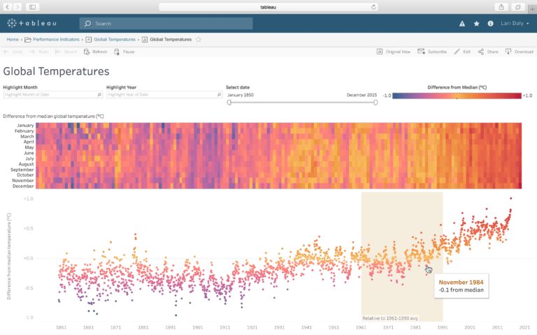
Tableau aids Data Visualization in Business Intelligence through a vast ecosystem:
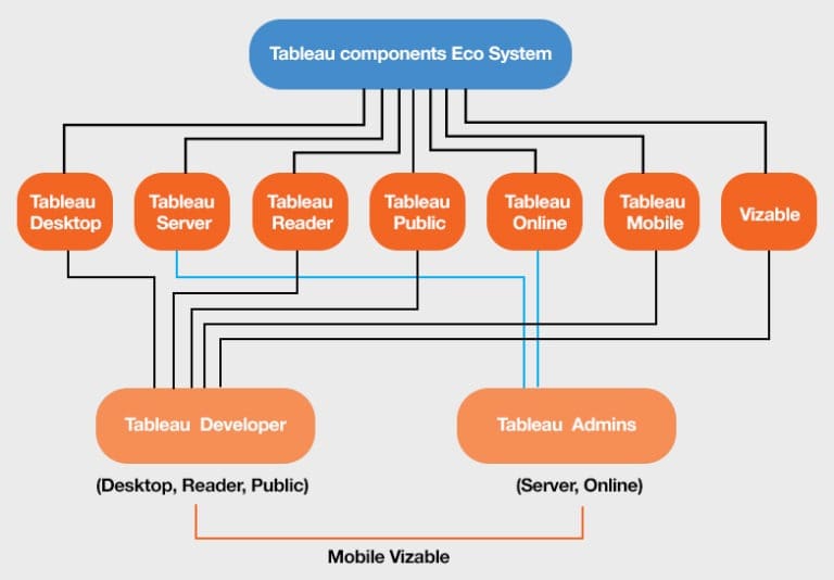
The Desktop (for individual use), Server (provides sharing, collaboration and security of data), Online, Mobile, Reader (a desktop version to read and interpret data. It has the workbook file to store the saved data), and Public (interactive between users). Although there are many charts that are in place to visualize data, the good news for you is that Tableau does not require you to know anything about them. Yes, the tool is intelligent enough to suggest which kind of data visualization will suit your data type and also allows you to manually change it if you want to do so.
Tableau comprises of 3 parts. The worksheets, the dashboard and the layout container. The dashboard is the core and is a coagulated display of all the worksheets and if you work with more than one worksheet, you will see how the magic happens here. Each worksheet in the dashboard has visualizations of different kinds of data, streaming in from different sources. The layout containers allow you to change the co-relation between the different data visualizations (e.g. graphs and charts)
Tableau Features
The Tableau Prep helps combine data and to clean the data for analysis. It makes data preparation easier. Find out more about it in our article here. ‘Hyper’ is another revelation from the Tableau stable. It boasts of a revolutionary data entry technology that lets you bring data into Tableau 5 times faster, perform queries to analyze data up to 3 times faster, and pull in a much larger dataset for analysis that was impractical before.
But the latest from Tableau is ‘Ask Data’ where you can use natural language to get insights directly from any data source. All you need to do is just type a question and you get the answer in form of a visualization!
Common Terminologies:
- Measure: A field with a numeric value, which can be measured or calculated, like profit and sales.
- Dimension: Values which cannot be aggregated, like names and places.
- Page shelf: Analyzes data based on individual values within a field. A set of pages are created, with a different view on each page.
- Filter shelf: To add or remove data from the data pane to filter the data. These filtered dimensions and measures are then displayed on the filter shelf.
- Row/Column shelf: Akin to the X and Y axis on the graphs. We can add values to get the pictorial representation.
- Marks Card shelf: Here we can drag fields to set color, shape, size or other details to add to the visualization.
Pros:
- Tableau gives the freedom of exploring large volumes of data without having to bother about the insights we are looking for.
- Does not require programming for real-time data visualization, as it has an interactive approach. Anyone without coding skills can use this business intelligence tool with ease.
- Can be set up in a few hours, with a variety of options for implementation and quick-start options. Even small-scale businesses can use Tableau for visualizing and understanding raw data.
- Now you can also extend the functional possibilities using dashboard extensions in Tableau.
Cons:
- Users have to manually update data as there is no automatic refreshing the reports, and when there is a change in data, no scheduling option is available. New visuals need to be created and then imported to Tableau. It is not a completely open tool.
- The table displays are formatted to 16 columns, and they need to be manually formatted to multiple fields by the user.
- Difference in the screen resolutions of the user and the developer distort the layout. A dashboard has to be created separately for a desktop and a mobile, as Tableau dashboards are not responsive.
- Data cleansing and formatting is not available. The basic preprocessing requires a tool like Tableau Prep to preprocess the data. Other tools like Alteryx, Power BI, Excel, or Python can also be used.
- Can be expensive for a large organization as cost increases with the number of users.
If you are confused about which Data Visualization is right for you, we have run a comparison between Tableau and Klipfolio and you will find it very insightful.
Decoding complex data into very valuable insights is what Tableau, offers you with its comprehensive data visualization in the world of bi. Use this explorative business intelligence tool and open doors of insightful understanding to see your data suddenly start making complete sense.
We enable marketers to make advanced data-driven decisions with our entire suite of data products, solutions and consulting services. And work towards optimizing your website with the correct Digital Implementation System, to capture the right data and its proper attribution.


