Tableau is a powerful platform. But have you wanted to search for a specific date range but didn’t know where to start? Well, in one dashboard we created, a client wanted to show trend lines for selected days and the previous days on the same axis. Follow along and we’ll lead you through the steps to do just that.
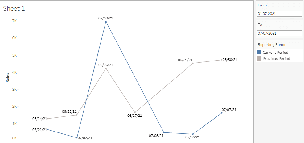
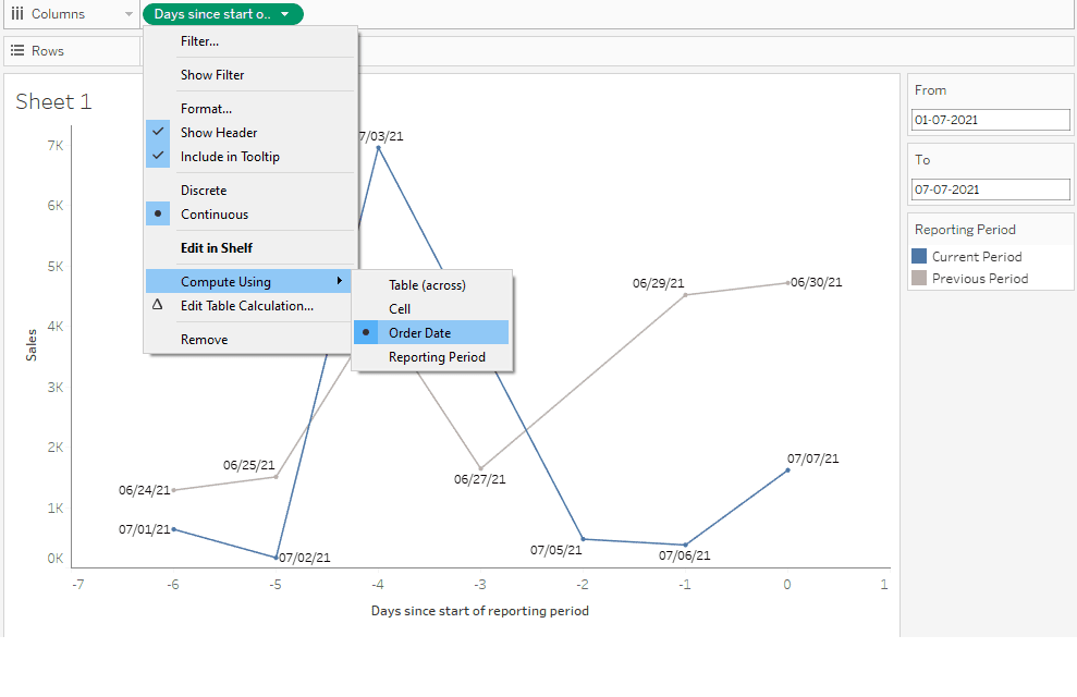
For example, in a report period between July 1 to July 7, 2021, we had to display the trend for the period of June 24 to June 30 on the same axis. See the graph below:
Since the comparison belongs to different day, and sometimes different month or year, plotting it on the same point is not possible with a Tableau feature. But, there’s a quick workaround to make this happen. Follow the steps below.
In the above chart, the blue line shows the trend line for the seven-day report period. The grey line shows the trend for the previous seven days from Jun 24 to Jun 30.
IDEA
Show trend lines for selected N days and the previous N days on the same axis.
SOLUTION DETAILS
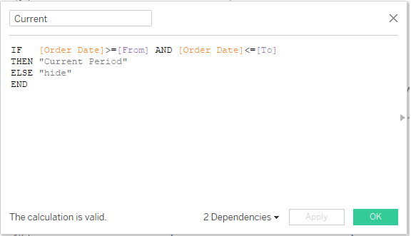
Step 1: We determine the current period and return a string with the date range of the current period or “Hide.”
Calculated field Name: “Current”
IF [Order Date]>=[From] AND [Order Date]<=[To]
THEN “Current Period”
ELSE “hide”
END
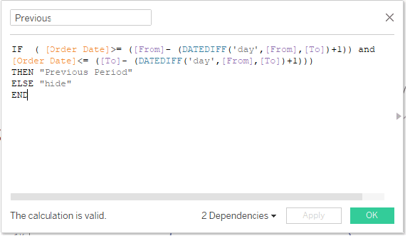
Step 2: We determine the previous period and return a string with the date range of the previous period or “Hide.”
Calculated field Name: “Previous”
IF ( [Order Date]>= ([From]- (DATEDIFF(‘day’,[From],[To])+1)) and
[Order Date]<= ([To]- (DATEDIFF(‘day’,[From],[To])+1)))
THEN “Previous Period”
ELSE “hide”
END
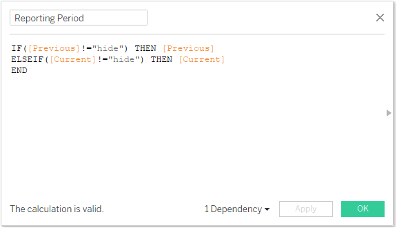
Step 3: Combine the first two calculated field to create legends.
Calculated field Name: “Reporting period.”
IF([Previous]!=”hide”) THEN [Previous]
ELSEIF([Current]!=”hide”) THEN [Current]
END
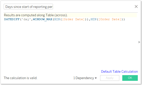
Step 4: We will create a table calculation to look at days since start for each line to plot our x-axis. This table calculation is computed using the Order Date field.
Calculated field Name: “Days since start of reporting period”
DATEDIFF(‘day’,WINDOW_MAX(MIN([Order Date])),MIN([Order Date]))
Sheet Setup
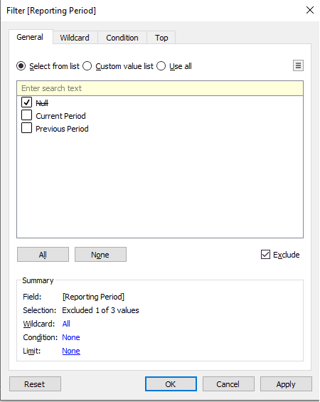
Step 1: Drag the calculated field “Reporting Period” to the Filter card and Exclude “Null” values
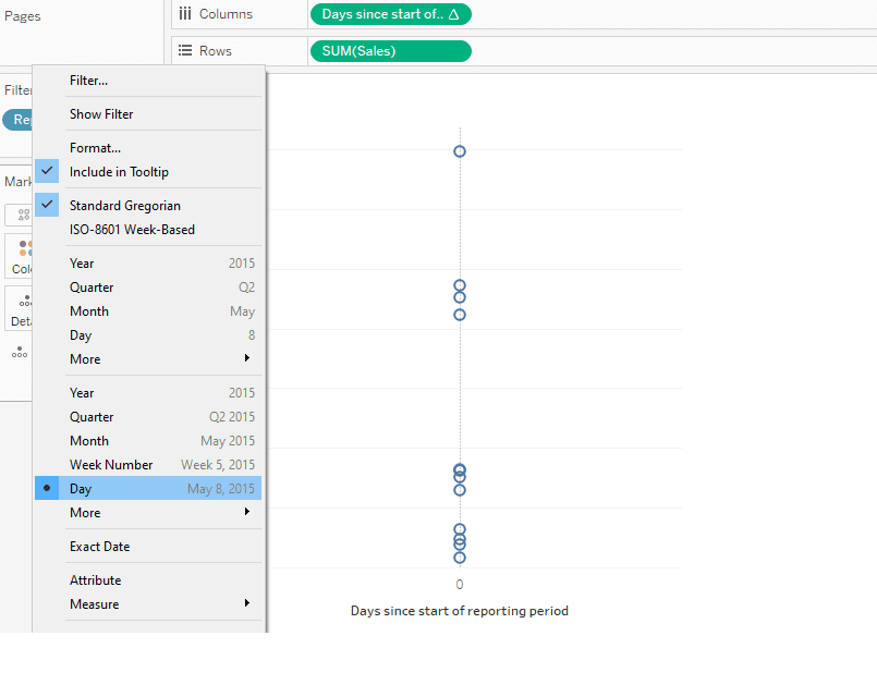
Step 2: Drag the calculated field “Days since start of reporting period” to the Column shelf and the “Sales” measure to the row shelf. Drag Order date to the detail shelf and set it as Continuous Day level as shown in the image below.
Step 3: Set the Marks as “Line.” Drag “Reporting Period” to the “Color” in Marks Card.
Compute “Days since start of reporting period” using “Order Date” as shown in the image below.
With this tutorial, you should now be able to compare different date ranges on the same axis within Tableau.


