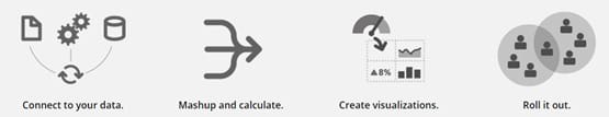
Data visualization has been gaining importance in the current business scenario. Every organization wants to use more data in a meaningful way to get deeper insights. An expressive visualization can make decision-making easier and timely. Visualization can also go a step further by enabling interactivity or drilling-down facility – moving beyond the typical static visuals and knowing the underlying reasons. Decision Foundry provides BI consulting services in Datorama, Tableau, and, Power BI.
In this article, we will discuss two tools that help organizations in their own unique ways: Klipfolio Vs. Tableau. With real-time customizable dashboards, Klipfolio is an approachable solution for all size of businesses whereas Tableau is a tool which is smart and sharp in exploratory purpose. Let’s get to know these guys well!
Klipfolio
Klipfolio comes to you with some of the best features for a standard dashboard. The tool is capable of manipulating complex data by its powerful transformation engine. Klipfolio makes it easy to connect to a huge list of data sources by making use of its pre-defined connectors along with traditional way of Excel, CSV, etc.
- Data architecture : Klipfolio data architecture helps to keep complicated data schemas away in all major cases. It helps to create any number of visualizations from a single data source and also to create single visualization from multiple data sources. Switching between data source for deriving a view is something Klipfolio can do smartly. You don’t need to go for data blending or table joins. In the case of web-based data sources, automated refresh can be made to a granularity of 1 minute. Pre-defined connectors along with other public and private APIs and SQL servers, help the tool to communicate to all major data sources which are available in the market.
- Visualization : Klipfolio has some brilliant visualization elements /charts in its kitty. They are easy to build and help to “see” the data in the most effective way. The indicator systems available in Klipfolio make it easy to visualize the reaction we need according to the data. Reaction could be anything like a color change when % change goes above the threshold defined. The tool is flexible enough to use other third party visualization elements in our dashboard. You just need to export the code and embed, and you are done.
- Data monitoring and sharing : Klipfolio is flexible enough to empower you to create extraordinary dashboards while gently directing you down a path of responsible design. Dashboards built in Klipfolio are responsive to Mobiles and Tablets which make it a user-friendly place to consume data. The dashboard can be shared through emails or it can be downloaded as image or pdf. It is also possible to embed individual widgets to any other website or blogs.
The dashboards created can also be access controlled to restrict or segregate users pertaining to the data they should see. With all the features explained above, Klipfolio takes the top place for standard reporting or visualization requirements of all organizations irrespective of their size. With an effective pricing it provides incredible value to organizations that need to consume operational or analytics dashboard.
Let’s move to another face of dashboards which are interactive and geared with abilities to explore, thus helping to “see” the data much better. Let’s talk about Tableau:
Tableau
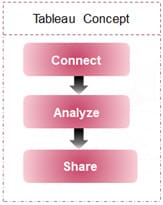
Tableau offers rapid-fire business intelligence that equips anyone to analyze data quickly regardless of role or industry. Its intuitive user interface means there is no need for canned reports, dashboard widgets, or templates to get started. Its visual analytics feature provides the fastest way for people to explore and understand data of any size . Where Klipfolio is perfect for standard reporting of analytics or operational dashboards; Tableau takes the route of exploratory analysis. Even though you could make good static score-card-like reports in Tableau, one could only completely utilize the tool if there is a need for diving deep into data and the urge of tracing reasons behind the story that data tells.
Data architecture
Wherever the data might reside, Tableau could be used as a single tool to connect, visualize, and analyze the data. Tableau has native connectors to many common databases, such as Microsoft SQL Server, MySQL, Teradata, Oracle, EMC Greenplum, HP Vertica, and more. These native connectors are optimized to increase performance, leverage the particular capabilities of each data source, and honor and enforce security protocols.
Visualization
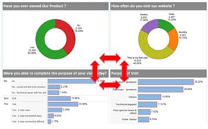
Tableau is a tool which stands out because of the interactivity it provides to the user. The drag and drop ability to build a view takes a few minutes once the data source is connected to Tableau. The show me feature in Tableau makes it intelligent to suggest the most suitable chart for the selected metrics and dimensions.
As there is no need of advance coding or scripting, Tableau always helps to reduce the dependency on a developer. When it comes to drilling down into data, Tableau is one of the best tools in the market. This feature enables the user to navigate to different hierarchies and understanding the next level of the data. In most of the tools this would not be possible, keeping the secondary layered data always hidden from the surface.
Drilling down can be enabled in a dashboard by switching on the “Chart as Filter” option. This would help the user to use charts as filter. Clicking on a particular chart element will filter out the entire dashboard for the corresponding data. A proper arrangement of a series of data would help the user to reach to the very fundamental measure or dimension which caused any unexpected behavior in the overall pattern.
Data monitoring and sharing
Tableau is dashboard software that allows non-technical users to create interactive, real-time dashboards in minutes. The best part with Tableau is that, it can move forward and provide the next level of dashboards which provides interactivity. It also helps the end user to edit the published dashboard and create his or her own views. This kind of flexibility makes it a superb tool for ad-hoc analysis or exploratory purposes.
Let’s summarize the things we have discussed so far. The table below will give you a quick comparison of Klipfolio and Tableau:
Adding filters and drilling down is as simple as a few clicks in Tableau. And visual best practices are baked in, so we can build a great dashboard and communicate effectively. Tableau dashboards can be shared with end users in multiple ways. One can do it through Tableau’s own complimentary solutions like Tableau Online or Tableau Server or one can send a Tableau file which can be viewed through Tableau Reader. Other than these options, we can download the tabs as pdf or images or we can also share the codes or link to embed or view respectively.
Let’s summarize the things we have discussed so far. The table below will give you a quick comparison of Klipfolio and Tableau:
| Features | Klipfolio | Tableau |
| Drilldown | Supports one-level of drilldown for tabular widgets | Supports rich drilldowns |
| Predefined connectors to major data sources? | Available | Available |
| Joints and data sources blending | Need to code for achieving this | User-friendly interface to achieve this |
| Views creation | Done by making use of functions | Drag and drop |
| CSS customization | Available | Not Available |
| AdHoc Analysis | Not applicable | Idea for AdHoc Analysis |
| Data Manipulation | Supports a wide range of pre-defined functions that allow the analyst to slice and dice data. Requires knowledge in custom syntax. | Supports a wide range of pre-defined functions, compared to Klipfolio complexity is less. |
| Product / User license |
|
|


