Key Highlights
- Buckle up, data nerds! We’re about to explore the sexiest side of data – the visualizations that make numbers sing.
- From tracking pandemics to mapping meteor showers, these visual feasts transform raw data into captivating stories.
- Think of it as art with an analytical edge, where bar charts become masterpieces and infographics, your new obsession.
- Ready to turn spreadsheets into captivating narratives? Let’s dive into a world where data visualization reigns supreme!
- We’ll uncover the tools, techniques, and trends shaping the future of visual storytelling, one stunning chart at a time.
Visual Awakening
Data visualization has transformed the way we understand and interact with information. It reveals insights and patterns that would otherwise remain hidden through its unique blend of art and science. Data visualization redesigns mundane graphs and spreadsheets into stunning visual experiences. Join us on a journey to explore interactive and dynamic visualizations that captivate, inspire, and uncover the fascinating narratives within the world of data.
Inspiring Data Visualization Examples to Explore
Get ready, data lovers! Come on a visual journey with us as we uncover the most captivating data visualization examples. These exceptional designs showcase the power of visuals in storytelling, transforming intricate data into engaging and accessible narratives. Prepare to be inspired by the most impressive and innovative data visualizations from recent years, carefully curated to spark your imagination and ignite your passion for data-driven storytelling.
1. CRM and Sales Performance Visualization
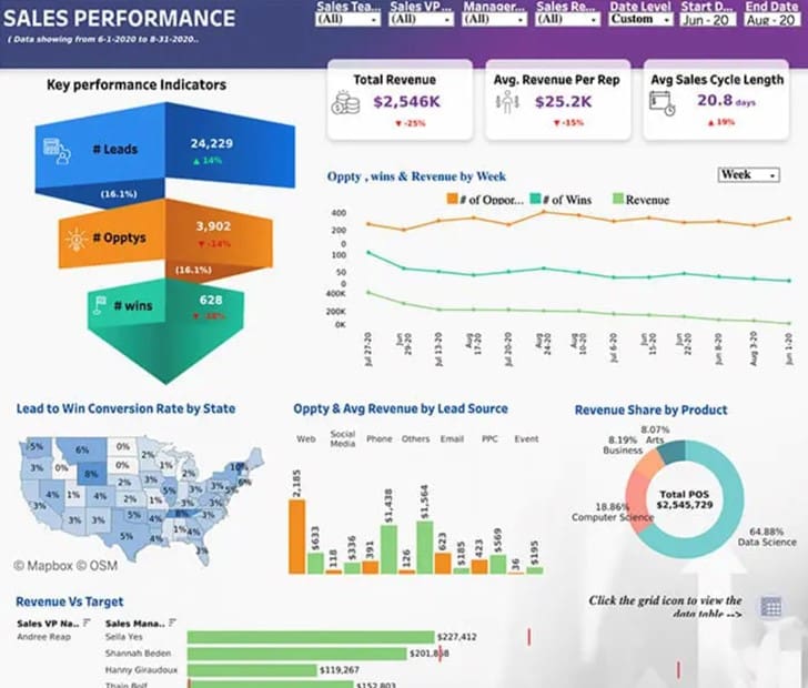
Ever wondered what drives sales success? Our Tableau dashboard (below) reveals the sales journey from leads to wins, uncovering revenue insights across every stage of the sales lifecycle. This visualization helps sales teams pinpoint areas for improvement, optimize their strategies, and boost revenue growth.
With this dashboard, businesses can:
- Track lead conversion rates and identify bottlenecks
- Analyze sales performance by region, product, or team
- Measure revenue growth and forecast future trends
2. Visualization of Internet Traffic Patterns
Who is using up all the internet bandwidth? Looking at patterns of internet traffic can give us a cool view of the busy online world that connects us. Picture moving maps showing how information travels, showing how much data is moving through fiber optic cables.
These images are not just pretty; they’re important for making networks work better. They help find slow spots and show us how people connect online. It’s like seeing the internet live – a fascinating flow of ones and zeros made real by data visualization. With AI growing and the demand for GPU chips rising, this digital dance will become even more complex and exciting.
3. Global Climate Change Over the Decades
Talk about a hot topic! Climate change is real, and we need to focus on it. It can be hard to show what is happening with our planet, but some great visuals really help. These images use past data from places like National Geographic and other science groups to show how our Earth is getting warmer over time.
Think about shrinking ice caps shown in time-lapse maps or big jumps in global temperatures shown in heated line graphs. These strong visuals tell us why we need to act now, much better than words can. They remind us that as temperatures go up, we must also do more to care for our planet.
4. The Evolution of Social Media Platforms
Remember MySpace? Well, data visualization does too. Looking at how social media platforms rise, fall, and sometimes rise again is like traveling through a crowded digital jungle. There are many new platforms coming up fast, even quicker than you can say “hashtag.”
Interactive data visualizations help us look at this fast-changing world. They show us which platforms are the best, how the types of users have changed (do you recall when Facebook was for college students in the United States?), and which features catch our attention. It’s an interesting (and a bit scary) view on how social media affects how we connect online, particularly for Americans.
5. Mapping the Human Genome
Mapping the human genome is like putting together a very complex jigsaw puzzle. Instead of using cardboard pieces, we have billions of lines of genetic code to work with. Luckily, data visualization tools are ready to help us.
Picture colorful spirals, with each nucleotide shown as a different shape or color. This reveals the amazing dance of life that is coded in our cells. These visualizations play a key role in moving genetic research forward. They help find disease markers and uncover the secrets of the blueprint of life.
6. Consumer Behavior and E-commerce Trends
Online shopping lovers, this is for you! Looking at how people shop online and what trends are out there is like looking into everyone’s digital shopping carts. These helpful dashboards show us everything from popular product types to how customers buy things. They show what makes us hit that “add to cart” button.
The E-commerce Tableau dashboard we built for a customer (below) provides actionable insights into revenue drivers, customer purchasing behavior, and sales funnel performance. With this dashboard, online retailers can pinpoint opportunities to enhance customer engagement, optimize marketing campaigns, and drive business growth.
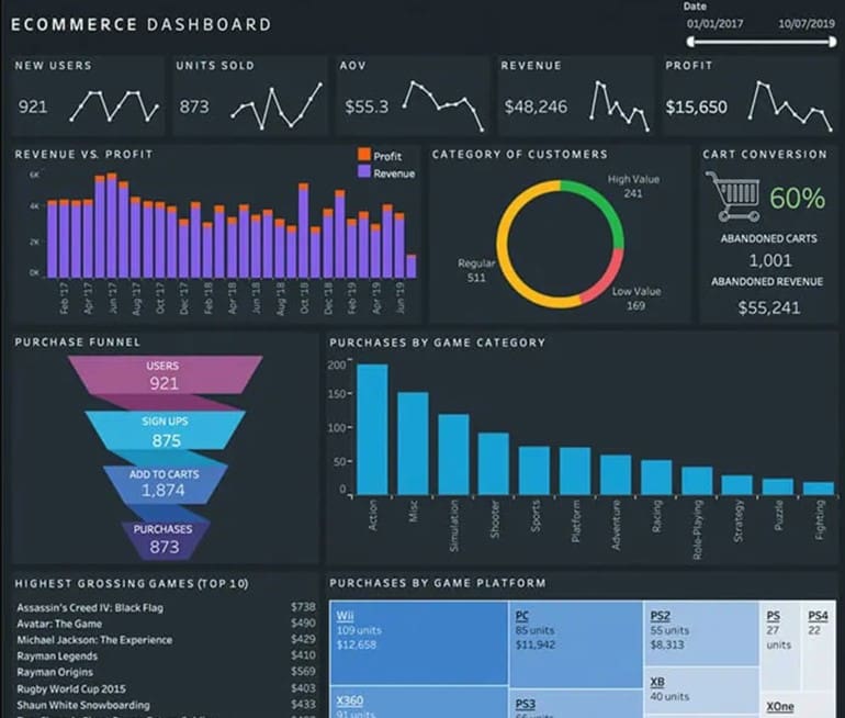
Major online stores rely heavily on this information to enhance their websites, suggest products, and keep customers engaged. Data plays a crucial role in understanding (and subtly influencing) our purchasing decisions.
7. Worldwide Refugee Movements
Behind the news and numbers are real stories of people who have been forced to leave their homes. Looking at maps of refugee movements helps us understand how big this crisis is. Words alone don’t show the full picture. We are using maps that show how migration happens over time, often based on data from the New York Times and UNHCR, including a striking distribution chart from The Guardian that demonstrates how the homeless are often relocated to areas with lower median incomes.
These maps can show how war, persecution, and natural disasters affect how many people live in an area. They remind us that we need to provide aid and find lasting solutions. These visuals also highlight the human price of global problems and show how important it is to care for each other, especially in the context of world history and the various refugee movements that have occurred throughout time.
8. Trends in Global Literacy Rates
Education is powerful. Looking at literacy rates around the world helps us see how we are doing in becoming more informed. These helpful charts use data analytics and statistics to show how literacy changes over time and in different countries.
Think about colorful line charts from Wikipedia that show the steady growth of global literacy. Also, there are heat maps that point out places with little access to education. These remind us that we still have work to do. By looking at this important data, we can find the areas that need more educational help, check how well literacy programs are working, and celebrate our progress in global education.
9. The Growth of Renewable Energy Sources
Fossil fuels are becoming a thing of the past. Watching renewable energy grow is like seeing the future happen. The Washington Post often uses bright pie charts and area graphs. They show how solar, wind, and other renewable sources are taking up more space in the world’s energy supply.
These visuals give hope for a cleaner and more sustainable future. They point out how green technologies are helping us use less fossil fuel. This is a strong reminder that we can have a brighter future. It only takes continued investment in these solutions.
10. Financial Markets Over the Last Century
Hold onto your wallets, everyone! Looking at financial markets over the last hundred years is like going on a crazy ride on a stock market roller coaster. You have amazing highs and scary lows. Do you remember the Great Recession? Those falling line graphs still haunt us.
But, there’s more to it. These pictures give us important information about market trends and economic cycles. They help show the long-term effects of financial events, such as the correlation between cryptocurrency prices and graphics processing unit (GPU) prices. You can see everything, from the rise and fall of big companies to the ups and downs of cryptocurrency. All this is made clear with easy-to-read charts and graphs that help us understand even tricky financial data a bit better.
11. Sports Performance Analytics
Gone are the days when sports analysis meant just a stopwatch and a notepad. Now, it is all about crunching numbers and showing important plays visually. Sports performance analytics are changing how athletes train, how teams plan, and how fans enjoy the game.
We are seeing heatmaps that show shot selection in basketball. There are spider charts that compare player stats, and 3D images of the best running paths in football. These visual data formats give important insights into player performance. They show strengths, point out weaknesses, and help teams get an advantage over others.
12. Urbanization and City Growth Patterns
Remember those fast-motion videos of cities growing quickly? These videos help us see how cities change over time using data. From old small towns to big cities, these images show how cities spread out over the years. They also show what causes their growth and decline.
These visualizations can highlight changes in population density and how buildings and roads develop. They even show the effects of important historical events. All this is presented with interesting maps and charts that tell the story of our city-filled world.
13. Gaming Industry Performance Tracking
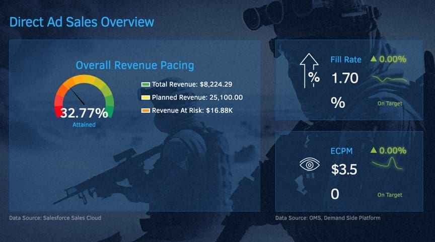
Step into the world of gaming, where data drives the next level of engagement. Our custom Marketing Cloud Intelligence dashboard (below), formerly Datorma, built for a leading gaming publisher reveals the winning formula for media performance, order management, and inventory control – all wrapped in a sleek, branded template.
With this dashboard, gaming publishers can:
- Track media campaign performance across channels and platforms
- Monitor order volumes, fulfillment rates, and shipping times
- Manage inventory levels, product availability, and stockouts in real-time
14. Advances in Space Exploration
Space is the final frontier and a treasure trove for amazing data visualizations. NASA and other space agencies use data visualization a lot. It helps them share complex scientific findings with everyone.
Do you remember those famous pictures of Earth rising above the moon? Or the stunning visuals of swirling storms on Jupiter? Those are great examples of how eye-catching data visualization can be, especially in the field of astronomy. With more private companies exploring space and dreams of living in the Star Wars universe, we can only imagine the incredible visualizations the future may bring. One example of this is the Active Satellites in Space data visualization created for Scientific American, which displays satellites in a colorful and unique way. This visualization is just one of the many advances in space exploration that have been made possible through data visualization.
15. The Changing Landscape of Global Education
Education is always changing. Looking at the different aspects of global education helps us understand access, spot trends, and compare learning results from different countries. These visuals can show gaps in education, show how global efforts are helping, and follow the growth of online learning platforms.
By turning data analysis into easy-to-read visuals, we can find ways to get better, celebrate what works, and strive for a future where everyone can reach their full potential.
The Art and Science Behind Effective Data Visualizations
Creating a data visualization that stands out is not just about putting numbers on a chart. There is a real skill to it. It requires a careful mix of looking good and being clear, as seen in a good example of data visualizations. Good visuals not only catch the eye but also help the data tell its story. So get ready as we explore the art and science behind making effective data visualizations, with inspiring examples of data visualizations. When it comes to storytelling with data, how it looks matters a lot!
“By placing the user at the center and prioritizing their understanding, exploration, and engagement, data-driven products and services can break down barriers, making data analysis and interpretation an intuitive and enriching experience for a broader array of audiences.”
Our approach to data visualization is guided by three key principles that prioritize clarity, simplicity, and ease of use. These principles are designed to put the user at the forefront of dashboard development, ensuring a better data experience. Focusing on clear and concise presentation, simple and intuitive visuals, and easy navigation, we help users to quickly understand and act on data insights. For a deeper dive into these principles, check out our article “3 Data Design Principles“.
Clear and Simple Visuals
Effective data visualization centers around simplicity and minimalism, as clear and simple visuals can greatly improve the user’s ability to interpret and engage with the information presented. This is the essence of good Information Design. Minimalistic design principles, consistent color schemes, and appropriate typography can be used to create an intuitive data visualization environment that users can quickly understand.
Hierarchy of Information Design
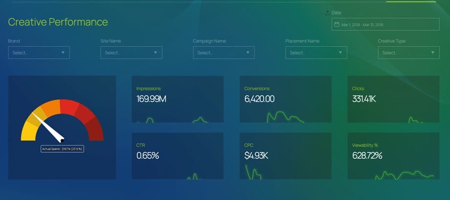
Establishing a well-defined information architecture is critical in data visualization. This may involve organizing visuals into logical categories, prioritizing information based on its relevance and context, or defining relationships between specific elements where necessary. A well-structured information architecture always helps improve the user’s ability to find and comprehend the data they need. The Marketing Intelligence Dashboard below is a prime example, with its clear categorization of metrics, intuitive navigation, and logical grouping of related data, making it easy to identify trends and insights.
Consistency and Familiarity
Maintaining a consistent design language across visual representations is crucial in data visualization. Simplification of complex ideas should be the goal, so that difficult concepts and attributes can be understood efficiently. Make navigation seamless for end users and make it easy for them to recognize patterns, trends, and outliers without having to dive into intricate textual explanations.
Spark, Ignite, Act
Data visualization ignites a deeper understanding, casting a light on critical issues like global literacy rates and refugee movements. Numbers are transformed into narratives that inform, inspire, and compel us to act. Thoughtful design principles like color psychology and simplicity fuel this transformation, making complex data more accessible and actionable. As you delve into this vibrant showcase, discover how data visualization reveals new perspectives, sparking innovation and insight that can change the game.
Frequently Asked Questions
What Makes a Data Visualization Effective?
A good visualization is like a well-made cocktail. It mixes simplicity, clarity, and visual charm. It shares a story with data. It uses best practices and creative ideas to catch the audience’s attention and highlight important insights!
How Do You Choose the Right Type of Chart or Graph?
It’s important to find the right match for your data’s style! Pie charts really like percentages. Line charts focus on trends, and bar charts excel at showing comparisons. Think about how the data is arranged. Is it spread out evenly or grouped together? This will help you when choosing from different shapes and chart types.
Can Data Visualization Influence Decision-Making Processes?
Data visualization changes raw data into easy-to-understand insights. This helps you see trends, find outliers, and make better decisions. Interactive data visualizations take this further. They let users explore the data, discover patterns, and understand more. This is very important for making smart decisions.
What Are the Emerging Trends in Data Visualization?
Data visualization is improving a lot! Imagine using AI tools to make charts easily and create custom visuals. You can also have virtual reality experiences that make data exciting. Plus, there are real-time dashboards powered by big data. The future will be interactive and lively, all thanks to open source technologies. Get ready to be surprised!


