
Patterns in the Data
From tracking pandemics to predicting market trends, our world increasingly runs on data. But data alone isn’t enough – it’s the insights drawn from that data that drive progress. Data visualization bridges this crucial gap, transforming abstract numbers into clear patterns that inform decisions, guide policy, and shape our understanding of complex systems.
This intersection of statistical rigor and visual storytelling has evolved far beyond simple graphs and charts. Visualization techniques reveal subtle correlations in scientific research, uncover emerging opportunities in global markets, and help leaders spot critical trends before they become obvious. In fields ranging from climate science to consumer behavior, visualization has become the lens through which we extract meaning from mountains of information.
At its core, data visualization is about amplifying human understanding. It taps into our natural ability to spot patterns, embracing the truth that a well-crafted visual can convey complex relationships more effectively than pages of numbers ever could. Whether analyzing sales data or studying social networks, visualization turns information into insight, transforming the way we understand and interact with data.

Understanding Data Visualization
Numbers rarely speak for themselves. A spreadsheet of sales figures might contain groundbreaking insights, but those insights remain locked away until someone presents them effectively. Skilled data visualization converts raw numbers into clear, actionable stories that drive business decisions.
The Definition and Purpose of Data Visualization
Information visualization takes numbers and statistics and converts them into visual elements that our brains process naturally. Data scientists and analysts use various visualization methods to help organizations:
- Pattern Discovery: Uncover patterns in large datasets that remain invisible in spreadsheets
- Metric Tracking: Track key metrics through visual analytics dashboards
- Clear Communication: Present findings clearly to both data professionals and the general public
- Strategic Planning: Ground strategic decisions in solid data rather than instinct
Key Elements that Make Effective Data Visualizations
Strong visualizations succeed by balancing three essential elements: accuracy, clarity, and impact.
Accuracy stems from selecting appropriate data visualization methods for specific data sources and goals. Time-series data typically needs line graphs showing trends along a vertical axis. Geographic comparisons might require choropleth maps. Market share analysis often works best as a simple bar graph. Scientific visualization in fields like medicine or engineering demands specialized charts that maintain precise data values.
Clarity requires careful editing and design choices. Each series of data points should contribute meaningfully to understanding. Remove distracting elements, choose colors purposefully, and ensure labels guide viewers to key insights.
Impact comes from answering specific business questions rather than displaying every available metric. Effective visualizations might address:
- Growth Analysis: Which customer segments drive sustained growth?
- Operations Assessment: Where do operational bottlenecks occur?
- Market Trends: What sales patterns suggest upcoming market shifts?

The Process Behind Data Visualization
Creating effective visualizations demands more than just picking charts and choosing colors. Data professionals follow a structured approach to turn raw information into visual insights, ensuring each visualization serves its intended purpose while maintaining accuracy and clarity.
Data Collection and Preparation
Every strong visualization starts with clean, reliable data. The first phase involves gathering relevant data points from multiple sources – databases, spreadsheets, APIs, or sensor readings. This raw data rarely arrives ready for visualization.
Consider a national retail chain analyzing their seasonal buying patterns. Their initial dataset included:
- Store Coverage: Store transactions across 500 locations
- Historical Data: Three years of historical sales data
- Demographics: Customer demographic information
- Environmental Data: Local weather data for each store
- Economic Context: Regional economic indicators
Design and Implementation
The design phase translates business questions into visual solutions. This requires understanding both the data structure and the audience’s needs. Technical teams might need detailed scatter plots showing statistical correlations, while executives often prefer simple trend lines highlighting key metrics.
Critical design decisions include:
- Visualization Selection: Selecting visualization types that match the data structure
- Accessibility: Choosing color schemes that work for all viewers, including those with color blindness
- Scale and Context: Setting appropriate scales and axes
- Documentation: Adding context through labels and annotations

The Importance of Data Visualization in Decision Making
Most businesses collect vast amounts of data about their operations, customers, and market conditions. But despite massive investments in data collection and storage, many struggle to extract meaningful insights. Raw numbers fill spreadsheets but rarely drive action. Strong data visualization solves this core problem – turning abstract numbers into concrete insights that shape decisions.
How Visualization Drives Better Decisions
Data science teams understand that different ways of presenting information serve different needs. When analysts examine customer behavior, line charts might reveal spending trends, while pie charts effectively show market share, and bar charts compare performance across regions.
The benefits of data visualization become clear when examining complex data sets. A retail chain’s customer data might show unremarkable sales growth in spreadsheet form. But visualize that same data set through appropriate charts, and clear patterns emerge:
- Seasonal Analysis: Seasonal trends through line charts tracking monthly sales
- Market Segmentation: Market segments through pie charts showing customer categories
- Performance Metrics: Store performance through bar charts comparing locations
- Product Analysis: Product mix analysis through stacked charts showing category share
Real-time Visualization: Moving from Reactive to Proactive
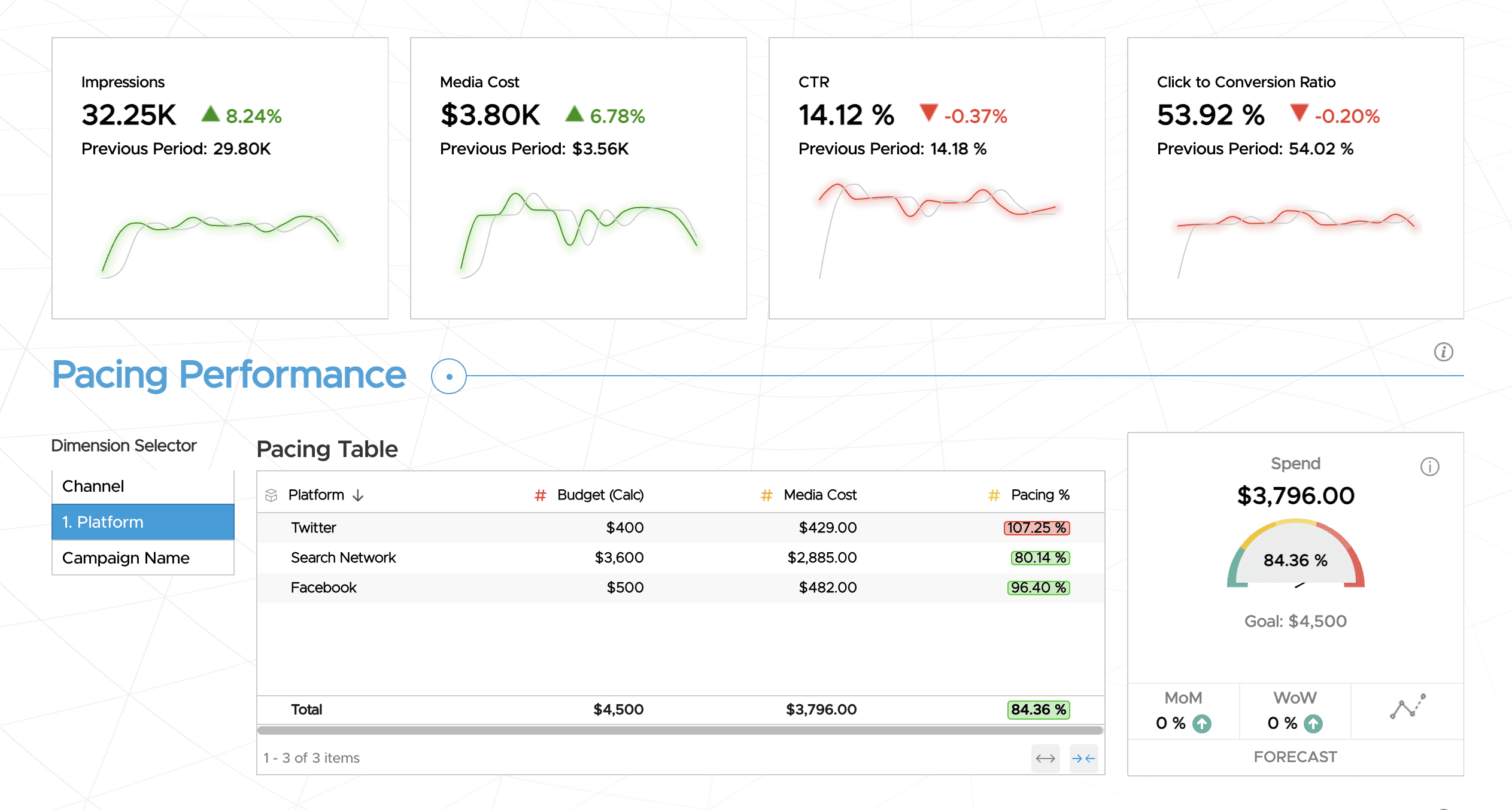
Real-time visualization takes decision-making further by tracking key performance indicators as they change. Consider supply chain management. Spreadsheets might show current inventory levels, but real-time visualization dashboards reveal emerging problems:
- Inventory Management: Parts shortages before they halt production
- Logistics Optimization: Shipping delays while there’s still time to adjust
- Quality Control: Quality issues when they first appear
- Demand Planning: Demand spikes while inventory can still be adjusted
Major retailers now monitor sales, inventory, and shipping data through live visualization dashboards. Store managers spot potential stockouts hours or days before they happen. Distribution centers adjust shipping schedules based on clear visual alerts. Marketing teams see campaign performance in real-time and adjust messaging on the fly.
The value proposition becomes clear: organizations mastering data visualization make faster, smarter decisions because they see opportunities and problems sooner. The competitive advantage grows as markets move faster and data volumes increase. The question isn’t whether visualization matters – it’s whether organizations can compete effectively without it.

Types of Data Visualization Techniques
Numbers only become valuable when people can make sense of them. Data visualization bridges this gap, turning abstract data into clear visual insights that anyone can grasp. While tools and techniques have evolved dramatically, the core goal remains simple: help people see patterns, relationships, and trends they might otherwise miss. The difference between good and great visualization often comes down to choosing the right visual approach for both the data and the audience.
Common Visualization Types and Their Applications
The most fundamental visualization types remain powerful tools when used appropriately:
- Bar Charts: Excel at comparing values across categories, making them ideal for showing sales by region or expenses across departments
- Line Charts: Reveal patterns over time, perfect for tracking metrics like revenue growth or customer acquisition
- Basic Diagrams: Simple diagrams like Venn diagrams and pie charts work effectively for showing relationships and composition when dealing with clear category distinctions
More specialized visualization types serve specific needs:
- Heat Maps: Uncover patterns in large datasets by showing intensity – essential for big data visualization of customer behavior or system performance
- Scatter Plots: Help identify relationships between variables, particularly useful in machine learning applications and predictive analytics
- Tree Maps: Organize hierarchical data visually, helping business intelligence teams break down complex structures
- Network Diagrams: Illuminate connections and dependencies, particularly valuable for artificial intelligence relationship mapping
Choosing the Right Visualization
Selecting effective visualizations requires understanding both your data’s structure and your audience’s needs. While sales teams might need straightforward charts showing progress toward targets, data scientists often require detailed visualizations exploring complex patterns.
Key considerations when choosing visualizations include:
- Data Structure: The type of data you’re working with – whether categorical, numerical, temporal, or geographic
- Variable Count: How many variables you need to display together
- Insight Goals: What insight you want to convey – comparison, composition, distribution, or relationships
- Audience Knowledge: Your audience’s familiarity with data analysis
- Usage Context: Where and how the visualization will be used – presentations, dashboards, or analysis
Best Practices in Data Visualization
Even the most sophisticated data analysis falls flat if people can’t understand it. While creating visualizations might seem straightforward, the difference between an effective visualization and a confusing one often comes down to following core design principles. Mastering these fundamentals, you can create visualizations that not only look professional but actually help people understand and use your data.
Design for Understanding, Not Decoration
One of the biggest pitfalls in data visualization is prioritizing aesthetics over clarity. The most beautiful chart in the world fails if it doesn’t help viewers understand the data. Strong visualizations start with a clear purpose and strip away everything that doesn’t serve that purpose:
- Simplicity: Keep designs simple and focused – remove any visual elements that don’t directly contribute to understanding
- Consistency: Use consistent colors and styles across related visualizations to build visual patterns
- Emphasis: Highlight the most important data points through strategic use of color, size, or position
- Context: Provide clear titles, labels, and legends that give context without cluttering the display
Color and Layout Principles
Color and layout choices can make or break a visualization. Poor choices in either area can confuse viewers or even mislead them about the data’s meaning. The key is using these elements strategically to guide viewers through your data story:
- Purposeful Color Use: Use color purposefully – not every element needs a different shade
- Readability: Ensure sufficient contrast for readability, especially for text and small elements
- Accessibility: Consider colorblind viewers by avoiding problematic color combinations
- Visual Hierarchy: Match color intensity to data importance – draw attention to key insights
- Spatial Organization: Place related elements close together to show relationships
- White Space: Use white space strategically to separate distinct groups of information
- Alignment: Align elements to create visual order and reduce cognitive load
- Proportional Design: Size elements proportionally to their importance in the data story
Context and Scale Matter
A visualization without proper context is like a quote without its source – potentially misleading. The numbers and patterns in your visualization need the right framing to tell their story accurately. This means thinking carefully about how you present scales, relationships, and supporting information:
- Baseline Values: Include baseline values and scales that make sense for your data
- Data Uncertainty: Show uncertainty in data when relevant through error bars or confidence intervals
- Scale Consistency: Maintain consistent scales across related visualizations to enable accurate comparisons
- Clear Annotations: Provide clear annotations that explain unusual patterns or outliers
The Future of Data Insights
The heart of data visualization beats strongest in moments of genuine discovery – when a sales team spots an untapped market opportunity, when researchers uncover a groundbreaking pattern, or when a nonprofit identifies communities most in need of help. These sparks of understanding ripple outward, turning abstract figures into concrete actions that shape strategies, guide scientific breakthroughs, and inform policy decisions.
Great visualizations ignite curiosity and invite deeper exploration. They give executives the clarity needed for million-dollar decisions, allow scientists to share intricate findings with the public, and help citizens understand everything from election patterns to environmental changes. Clear, thoughtful visualization doesn’t just convey information – it opens doors to new questions, fresh perspectives, and bold ideas that push fields forward and inspire positive change. The future belongs to those who can not only gather data but present it in ways that illuminate truth and motivate action.
Frequently Asked Questions
What are the first steps to get started with data visualization?
Getting started with data visualization is simple! Begin by learning about different visualization techniques and software. After that, jump into data analysis. Try using the visualization software and improve your data visualization skills with every project you take on. Always keep in mind that practice is key!
How does data visualization help in understanding big data?
Understanding big data can be very hard. It’s like looking for a tiny needle in a huge haystack. But there is a way to make it easier. Visualization techniques can help. They show us hidden patterns and insights in big datasets. This makes it much simpler to understand the data.
What are some common mistakes to avoid in data visualization?
When you think about data visualization, remember that clarity, simplicity, and accuracy are very important. Stay away from common mistakes such as using too many charts, showing misleading data, and ignoring the context. Always keep your visualization clean, clear, and interesting!


