Ross Jenkins, Decision Foundry US CEO, and 2021 Salesforce Marketing Champion was invited to speak (sponsored by Salesforce) on the topic of Data Designing using Datorama. Decision Foundry has been working on Datorama consulting projects for the last 8 years. If you enjoyed this presentation, be sure to consider watching our other Datorama webinars.
Designing with Data: From Process to Production
We hope you enjoyed listening to the webinar. Click on this link if you face technical issues playing the above video-https://salesforce.vidyard.com/watch/cYByR65w1Jpm4TqSu2irXv
We’ve also transcribed the webinar for easy content consumption.
Webinar Transcript
[Emily]
Hi everyone. Welcome to the webinar. Thanks for your time and we hope this session will be interesting for you. I’m Emily and I work as a Product Marketing Manager at Datorama. Today we’ve with us Ross, who is the CEO of Decision Foundry, an award-winning digital consultancy, and a leading Datorama service provider. Ross is a 24-year veteran in the customer analytics and digital marketing space, and he is a real pro at providing exciting and engaging material. So, you guys are in for a treat today. He has spoken at Dreamforce conferences and has won a couple of awards as well. He won our Datorama Best Visualization Award 2018 and 2019 IAB Data Rock Star.
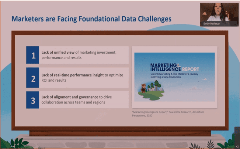
Today a marketer’s role is to be as nimble as possible. Marketers need to be able to drive business value. Data and measurement are the keys here. A recent survey done by Datorama shows that marketers are facing challenges with data related to – Lack of a unified view, lack of real-time performance insights, and lack of alignment and governance.
So, this is where Datorama comes into play. We help our customers to connect and unify all of their marketing data in a single system of record. And as a result, we see the impact across those four pillars. So our customers can provide much more personalized, empathetic, and engaging content to their customers.
They’re able to find wasted ad spend. On average, our customers uncover 30% wasted ad spend that they’re able to take and reallocate. They also gain back 80% of their time, which has been spent on manual data preparation and processes that can now be reinvested into gaining those deeper insights and testing and learning new marketing strategies, which is so important today.
And ultimately, marketers gain that complete alignment all their teams, their business units with visualizations that they’re able to share and that’s also the crux of what Ross is going to get into today. So with that, I’m going to pass it off to Ross, who’s going to take us through the rest of the presentation.
[Ross]
Yeah, Emily, thank you so much for that great introduction. Thanks all for joining this webinar. So I can tell you one thing, that after twenty-five years of sort of working in the data analytics world, that it’s a place that really can kind of humble you almost entirely, and almost regardless of your level of seniority, regardless of which industry, regardless of what particular sort of business model they hold, there are these really pervasive and persistent challenges that are almost incredibly too difficult to overcome.
As a data marketer today we have access to so much data and yet fewer insights. We have far more data to talk about and a few insights if any, and that’s kind of a missed opportunity on the whole. The reality is as an analyst, you want to sort of build these compelling visuals in which your clients can kind of get it on the spur of the moment.

And the next part is that, this kind of linear approach to sort of kicking off my project. It is based on the waterfall and it means it has a definitive start and definitive end. And that’s just not the way this kind of platform work really works. It requires a great deal of continuous development optimization and to think more creatively about what we need to change in midstream to reflect the values of the business.

But somehow we always end up underwhelming our clients. And here’s the reality, for the people who are invested in things like the infrastructure, talent, process, and indeed the data, the reality is that our adoption rates still sort of lag. And that’s some really scary thought considering the overarching investments only we have the opportunity to sort of recouping what we were doing and then reconnect with these clients. I can tell you with confidence that my most ambitious sort of reporting project, BI project, enterprise-wide sort of recording solution that you can think of, about 38% of the population is using the platform. But inside of three months, that adoption rate is less than 10%.

And I know that aspiration, what we’re trying to achieve at the end of the day. But there are very few organizations that kind of move beyond counting things like arrows going up and arrows going down and not changing much at all.
And so that is a really big opportunity for us, for everyone on this call to now try to do something different, to remember all those things that we all knew when we started this, that we wanted to drive more from our first-party data. So I think it kind of plays this way, is that data for me has always been a very personal journey, but it’s also connected to sort of this universal facade that I think we all are as data marketers understand this intuitively.

And this is just the reality of kind of how most of us are operating. So what do you do next? What do you do? Well, essentially, you need a data strategy, and it’s that lack of data strategy that ultimately causes the most harm.
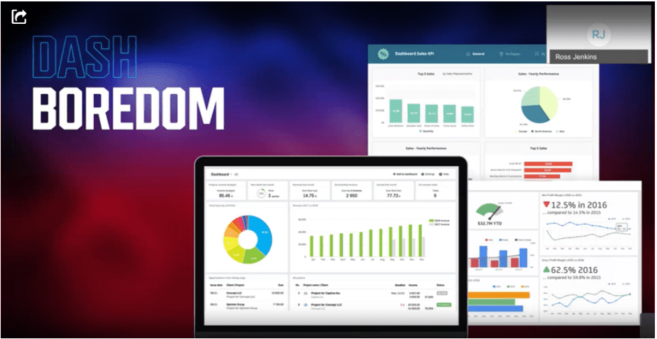
And because we have this inertia around sort of what we’re really supposed to do with data and how do we orchestrate and how do we sort of making these organizational changes, what ends up happening is what I call most pivotally this kind of concept of having this malaise with our clients. It’s this underwhelming feeling of the dashboard where it’s just the same and same out, how you take some Excel output, you take some basic output and you try to produce a report and you may make some tweaks and you maybe add a logo to it.
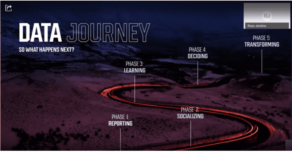
And so let’s revisit that sort of journey together, right? You start off with automating records or you’re doing some manual and the next step is kind of logical, which is you begin to socialize that information among your colleagues and department if you’re lucky to be able to extend beyond your department.
And then you start getting into phase three of it, which is like, I need to be able to learn. I need to sort of connect what I’m doing in terms of my dashboard, my automated reporting, my marketing intelligence efforts back to a measurement plan, back to a strategy. And I want to be able to say, can I get focused sort of outcomes. I can think about my financial impact, what is the business impact of what I’m trying to do, and to connect that back to what I’m ostensibly reporting. And then you would like to be able to help your organization to be able to make better decisions. And I’m going to avoid using the term digital transformation, whatever that ultimately is. I think, yeah, that’s an overused phrase, but really what we’re talking about is organizational change. And for all the value that an analyst that data marketer provides to an organization, well, what ends up happening is that it’s not really about you, it’s about everyone else in your organization and how do you help them connect the dots and learn how to use the data and onboard other data and extend the value of what you do with all the techniques and technologies and knowledge that you have a core across your organization. It’s a is a huge, huge opportunity.
And that doesn’t mean that I’m in the world of software development. I leave that to the very capable folks at Salesforce and Datorama to do what they do. But my job is to apply value and utility on top of the data, using the Datorama platform in various ways. And there’s going to be many, many different sorts of methods that I’m going to show you with real use cases.
But if this is supposed to be something that I think that we’re all wanting to aspire to, let’s start with an inspiration. For us as an organization, I’ve stopped dashboarding and recording quite some time ago. And I look for inspiration from other industries. Now, despite the commercial success of things like Peloton, the fitness apps that are focused around sort of taking massive amounts of your data, zero data, first-party data, and mashing it up into these otherwise, beautiful interfaces.
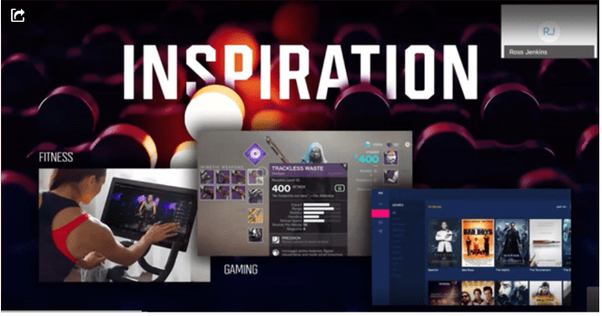
It’s really around sort of behavioral change and it’s highly, highly personal, right? The fact that you’re competing against yourself or others is an interesting method of using data. The second option that I’m showing here is an in-game day. And so gaming is about VP play. It’s about recurrence. It’s about buying and deepening the franchise and finding other titles. And all of that is about click, right? Increasing play, increasing adoption, and these things that are a little bit unfamiliar when you start talking about dashboards and reporting. It is the truth of the matter, we just don’t get that level of adoption and these aren’t that fun, in my personal opinion.
And then to the right, you have streaming devices. And when I think about streaming devices like Apple TV, they’re just one very large shopping cart in my personal opinion, but they’re beautifully done. If you’re sort of going through an interface and looking through potentially hundreds, if not thousands of different titles and they’re using machine learning to help you sort of figure out what is, what are you, what are you going to have an affinity against? It’s an interesting thing, but what do all three of these things have in common other than the fact that it’s obviously data-intense and, and commercially very, very successful. Well, if you sort of indulge me for a moment, don’t know what’s going on is you’ve got some fundamental truths about this.
Now, the gaming industry, which is largely driven by sort of its own engine, it’s predicated on things like JavaScript and CSS. And then you might say, well, Ross, why are we talking about JavaScript and CSS in the context of data? You’ll learn more about what I mean about that a little bit later, but this is the linchpin.
And for the next, I’d say maybe 30, some odd minutes, I’m gonna show you how I think, and we’re going to show you how we approach things. And indeed I’m even going to share some level of IP. I think for many on the call, you would say, well, why would you share your IP with us? I mean, surely you’re in the business of making money.
Yes, of course. But the truth of the matter is I think we’re all here to learn. And I think if you really have something, the thing of interest, if you truly believe in what you’re doing, then you share it. And so, as a result of that, I offer that now a little bit of disclaimer, you’re going to see some highly, highly creative things.
Decision Foundry, at the end of the day, is a digital analytics consulting company. So, for those of you who are new to Datorama, this is how Datorama approaches the basics and they do the basics extremely well.
But those of you who are students of Datorama, you’ll recognize this route. And so you can quickly onboard the data side. You can do some fairly standard sort of visualizations very quickly because it is a marketing intelligence engine. You can pretty much onboard any data set you to want from close loop marketing to things that happen to point of sales, to add certain platforms, DSPs, you name it. So as you change the source to the campaign filter, then sort of whittle it down, and then the campaign whittles down to the media, maybe you kind of get it. So part of the power of Datorama is to be able to onboard, to categorize from harmonized data sets. And so, clearly in this instance, what you have is that you’ve done some modeling versus control.
It’s quite powerful, but here’s where I think the rubber hits the road, datorama natively supports cascading style sheets, HTML, and JavaScript. Initially, CSS was really about sort of you know font placement and location, and sort of being precise and where elements on the page. And it was really around sort of placing elements where you needed to be in such a way where you didn’t have to overwhelm your page and that it was like this bloated patient. To just sort of say align left or right.
You just kind of have to test into it. I think that this is a huge, huge opportunity. So if you remember, when I went back initially and I introduced things around sort of fitness and gaming, and when I started covering off things on streaming devices, this is really where it gets interesting. So, with all that power of that datorama provides in terms of CSS, in terms of HTML, in terms of JavaScript, Datorama a few years ago, it created something called Canvas.
And really what it is, it is an editor for those individuals who maybe don’t want to bother themselves a lot of scripting. And then just kind of use what you see is what you get sort of approach and sort of, you were able to sort of add backgrounds and do simple sort of changes in layout. And that worked out pretty well.
But the truth of the matter is if it then becomes a kind of over purpose where essentially you’re taking backgrounds and using fonts that don’t align that well. And if you think about application development, this is a little bit underwhelming as well. And then if you’re close enough to Datorama, you can sort of leverage their approach, which is they have like a CSS, minimal sort of approach to the platform. It kind of creates an interest in the balance of all the different elements on a page. It allows you to stylize simple elements like table structure, which I think is good, you know, tables in terms of legibility are important when you starting to do sort of a more sophisticated layout.
Whether they are manually sort of ingested where an end-user provides those things when it’s old. Or that you’re using sort of this AI/ML sort of infused approach to bringing an insight, which has been around for some time and continues to improve.
These are all very, very worthy things to do. However, I’m going to take a little bit of a pause here, because this is where things are going to get different. This is the part where I go from talking academically to practical stuff. Then I show you a little bit more about how we do things behind the scenes. So I’m going to try to make this work.
Datorama allows a lot of flexibility. But if you’re also interested, you can sort of ingesting and configure things in highcharts and things in D3. And like, as you start to scroll through this very long list of items, there’s just a lot here. I think my last count is around 135 different sort of visuals that you could account for it.
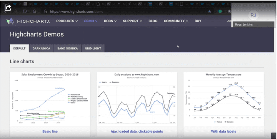
So that’s an incredible amount of creativity. But like, why am I talking about this? Well, because I can take some of these visuals. I can put them into Datorama and configure them. So I can take a simple graph like this and I can add annotations and suddenly it provides different meanings. And if I’m like, I’m starting with a spelling error, I’m starting with a sort of this approach where I start off very simple. And then I can kind of pick and choose through other sorts of JavaScript frameworks. And so we take this sort of the same framework, drop that into Datorama, and then we can create what we call sort of these KPI cards.
And the KPI cards are based in principle on properties that you can leverage from gage dot JS. It works well. It doesn’t look like all the other stuff. It’s customized to you and it’s relatively easy to get started.
You know, in 1990ish, when web design was very, very popular and you’d learn kind of these silly web tricks, but the truth of the matter is. As I look through this, there’s a lot of innovation that can be applied here.
So just indulge me for a moment about this. There’s a lot of really cool stuff to do here. So if you notice on the background, you’ve got the primary colors are changing. You’ve got the widgets within the widgets that are doing different things. These things are animated to some degree. It’s compelling. And if you’re a little bit creative, you can go a very, very long way with that. This is called the parallax effect. Yes, the parallax effect does actually work in Datorama.
The truth of the matter is once again, If you’re creative, if you understand how data model Datorama really works, how you can leverage the custom widgets, this simple effect becomes very, very powerful in effect, you are sort of mimicking the same sort of capabilities of web application or any other application, all that you can develop and putting those same kinds of strengths in the platform for you to use.
So it’s huge. And then I can take that same concept and I’m gonna try to refresh this and posting it doesn’t blow up. And so what you’re saying would say, CSS is like these elements load on the page, it feels clean and notice I’m using custom fonts and like I’m starting to get a little bit fancy. And what I’m trying to do is to take you into like how you build on a thing.
Right? So how do we go from innovation to driving something we’ve developed and then sort of making what we created a little bit better. And then there’s this version, which we kind of pull it all together. So now I’ve got the background wallpaper that’s animating and bringing all the elements and I’m controlling every element of this page.
And what you’re seeing here is that on load, the elements sort of refresh, and it goes from zero to whatever the increment needs to be in it. And I think that’s really where you can aspire to do more with the first-party data to do what would Datorama and to add utility.
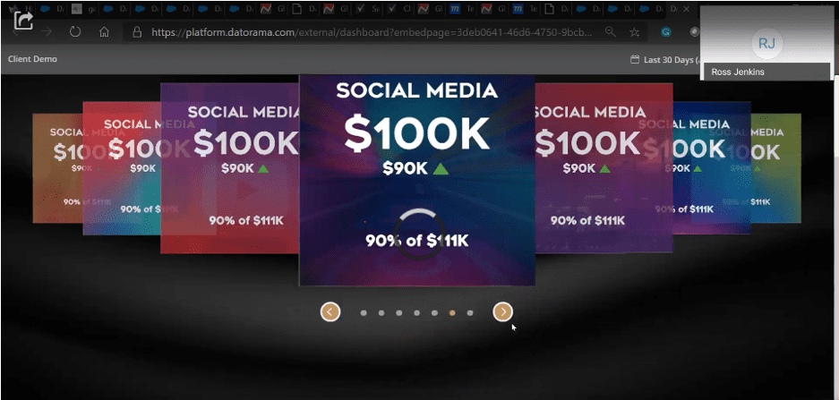
This was done on Datorama. And what you’re seeing all the elements I just talked to you about before the animations, what you have here is kind of a rotating carousel. You’ve got interested in CSS, dropdown menus. You’ve got these full skin widgets, which are just part of goal gauge and us enhancing things and bringing in different sort of custom visuals.
From D3 and highcharts and others, and I can kind of go on, but now I’ve created something that looks and feels like an application. And I’d like to push the client more towards something that doesn’t look quite an as the dashboard. But sometimes you really just need this amount of data, but you can still kind of entire experience around.
And I think that that’s, that’s really the point that I’m making here. Now going back to the slides these are all things that you can absolutely do. And this is the stuff that works natively. It’s not too difficult. Yes. There’s a certain bit of skill set against it. It takes some time and preparation.
You’ve got to have the right talent, but sometimes just having a talent and vision for what you’re trying to do is candidly not enough. You really, really need process. And when things get really, really crazy and they become difficult. What you need to do is follow the process. And so that means that your internal stakeholders or external stakeholders should never be allowed to break that process because when you do things go bad really, really quickly.
And so to be able to execute precision means following that product. So once again, I’m going to kind of go in, I’m going to share something with you. And this is an actual sort of project output.
And, and really what we think about when we develop these kinds of data applications is we go into pre-production where we’re sculpting, and then we go into production and then we’re orchestrating and harmonizing and blending. And then we, do the output visualizations, and then there’s the final delivery and acceptance. And then some things actually happened in the post-implementation. We’re trying to get our clients, whether they’re internal or external to adopt the platform, to understand it, and be able to maintain it just as if we were always around.
Kind of highlighting certain elements of this because I think they’re important. For us, we spend a lot more time in data discovery and sort of understanding what our stakeholders are they trying to achieve around understanding the vision and, and sort of making sure that we’re aligned in terms of like, how do we define success and what those metrics are. We go into sketching heavily and then we go into wires. Sometimes we bring in our data science group and support, develop specific models and that’s a part of our process. And so what you really have is a series of different disciplines that work on different parts of the project to come up with one cohesive sort of output.
So whether you’re a BI lead or project manager or solutions lead, or data scientists or project manager or client. We’re all collaborating on this and sort of, you know, using this platform, which is really inexpensive, which candidly, I love that it’s simple enough to create a measure of accountability.
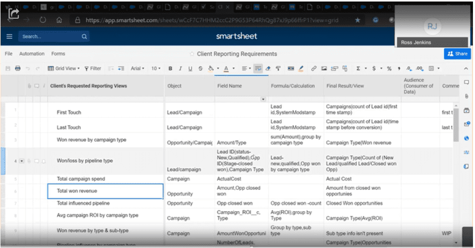
And then the other part of what we ended up doing is we’re very, very clear on in terms of what our stakeholders are ultimately looking for. So this is a client’s request saying, look, I need to see a recording view on first touch and last touch in total revenue. And so we have the client. Sort of outline everything that they’re really trying to do.
So there’s absolutely no ambiguity as well as sort of the whole concept of around how do we, how do we identify the specific objects or the field names and the calculations and what did we ultimately achieve? And who’s the audience. And I think you ultimately get it. And so this whole step-through process is necessary because if you miss these steps, ultimately you end up underwhelming the client.
You ended up delivering on something that honestly was unintended and nine times then you ended up reworking it because you just, candidly did it, you get it right. And so this may shock you a little. But in terms of our tools of the underlying sort of tools that we use on a day to day basis, it’s a relatively sort of affordable and non-sophisticated.
I’m going to kind of read from the top down and it really starts for me just in terms of pencil and sketch. I sort of am always doodling and figuring out exactly what interface needs to look like. And I’ll share that with internal dev teams, sometimes clients it’s a little bit too raw, and then we kind of move into mockups, which mockups actually is a tool we use for wire brain.
We actually use Photoshop for mockups and that’s kind of an internal joke that we use. And so it allows us to wireframe up exactly what we need. And I’ll show you examples of that. And then we’ve got sort of all the different sort of the Smartsheet, which is really our project planning. And then because so much of what we do is around designing proper interfaces that are technically very sophisticated, but simple enough on the end-users to leverage.
We use Zeplin. So we don’t teach our developers how to use Photoshop. That’d be a waste of time. We use Zeplin, which is a free tool where all the data assets that you use in Photoshop, all the style sheets and look and feel the exact measurements. All the assets associated with Photoshop get ported into this platform, downloaded by the developer, and uploaded it into the Datorama platform to produce all the things that I showed you previously.
And then of course there are requirements and those you must have it. Your document everything that you’re doing, whether that’s a business of technical requirement and you ensure that long after you’ve left the project, or maybe you have to revisit that everything is put in perspective, you can always reference the same document.
But here to me is the other area where I’m going to emphasize just for a little while, which is getting buy-in with a preface. And preface is a term that’s often used in cinema where essentially think about as the sketches, the wireframes, the cells that animators use to sort of figure out. What happens in each one of the screenings and that same technique can be used well when you’re trying to develop reports or dashboards or in our cases, applications, right on top of Datorama. And so I’m going to take you into a little bit about how we think.
And so, I have removed any reference to the client here, but this is actually client work. And what we’re doing here in this wireframe, we’re figuring out every single interaction.
And what we do is we kind of move through the interfaces and, you know, really be detailed in terms of what happens, every interaction, what shows, and it gives the clients a lot of confidence in terms of what we’re going to do versus let’s go right into the platform. Let’s onboard data. Let’s do visualizations.
This is the low tech mechanism to make sure that we get it right, because once you start developing. It’s hard to sort of go back in time and to do different things. So you want to get all your sign-offs and everything you’re doing with the custom visualizations, the labeling, the types of Contra using.
This is how we approach this, and this is how we get precision in what we do. So going back to slides, I think that there’s another opportunity. I think even as analysts, even as data marketers, about how do we use fonts? How do we use type and believe it or not type fonts, it has a place, it’s part of branding. They have their own personality type and believe it or not the difference between Times New Roman and Regenera, which is actually a different type of font that we use quite often, it matters. It completely changes the look and feels of something. And you can stylize things in such a way where there’s this unique sort of aspect to what you’re developing.
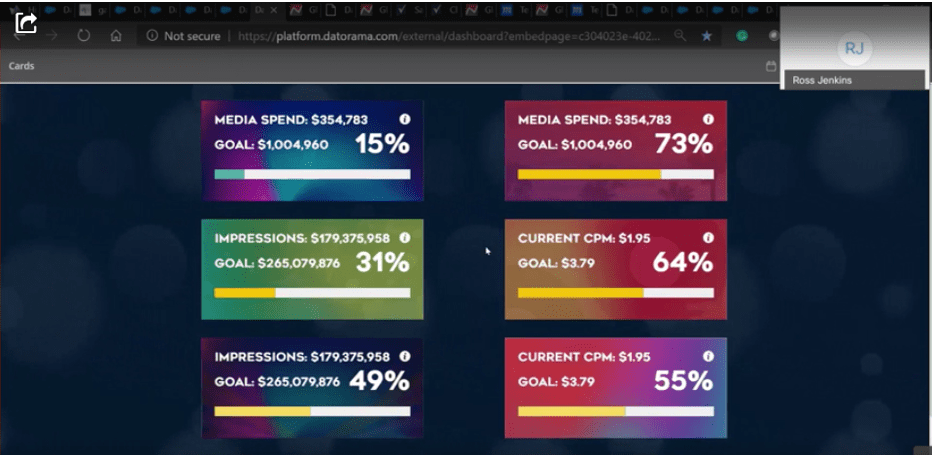
But what we try to do is to take a look at what we sketch, why are we mockup and then try to produce that pretty much with 99% confidence that what we produce is exactly what’s going to be executed within the platform. And that’s a skill, but it’s worth it. So just for a moment forget about the fact that this is tricky, this is really about performance management and we call this our KPI card and you’ve seen examples earlier and sketches and indeed through gage dot JS, which is another supported JavaScript framework that Datorama will to some degree support.
So what you’re really seeing here on top of this is that I’m really forcing the client to say, how do you want to better manage your business? Cause it’s easy enough to look at sort of changes or reporting period. But sometimes clients say literally, I want to see this month over a month and you don’t want to force them to like select a specific date.
That overrides sort of what know Datoroma typically wants to do with it’s the custom calendar, which changes everything. And you force the calculation to kind of create your own calendar within datorama. And if you know how to do that, there’s something really compelling about that because you’re giving a lot more control to your end-users, and you’re forcing them to think about how to better manage their business.
Instead of thinking about the reporting periods of the reporting period, you can provide them with attribution windows. That makes sense to their business, right? So a running average, so seven days or 14 or 21, you can do these calculations within Datorama. Make them a part of a custom widget and allow end-users to support them to the best of their ability.
Also so we use CSS to highlight when there is statistical data, a statistically significant change. Let’s say, for instance, it’s 25%, that the outline of the widget turns red or whatever color wheel ultimately wants to signify that there’s something meaningful, different, and you should take a look. And now we are getting to the crux of it.
So I’ve taken you under the hood. I’ve shown you kind of how we think I’ve shown kind of their process for how we do work. And now I’m gonna take you through kind of know stuff through anonymize. So with this particular instance, we’ve worked with a media agency generically that way based on the West Coast.
And so as a result of that what we’re trying to do here is to print where we call super template. Now in the world of Datorama, the super template can also be considered to be synonymous with an executive workspace, but it’s a little bit different. I mean, by that in many instances, our clients come to us and they’re leveraging Datorama, and they may say, be a part of a larger franchise and that franchise has brands and that brands have somewhere and different campaigns.
And what ends up happening is that you, end up spending or creating all these different dashboards. So instead of creating one universal dashboard, a lot of clients create hundreds, if not thousands of different dashboards to support different brands and sub-brands. And it just gets really messy very, very quickly, but the concept of it super template that we’ve developed with our friends at Datorama almost seven years ago.
Hey, look, we’re going to provide a standardized hierarchy, there’s going to be a certain flow that has specific visuals, specific dimensions, specific calculations. We’re going to make sure that the taxonomy and you kind of hold those things together to make sure that you can basically manage your entire enterprise reporting within one group of small templates versus maybe scores or even hundreds of templates.
And so I’m going to take you through kind of how we bring this to life. Give me a moment. And so this is us here and we’re using through Moqup with our client, you know, we’re kind of working with them, all the different interactions. Indeed, you know, our clients can provide us with comments and interact with us while we’re in the platforms and make sure that we’re delivering on exactly what we’re going to develop for them.
And every single action and micro action is identified and the client ultimately signs off on this. So they feel pretty good about the fact that we’re all moving in the right direction. And then there’s like this accountability in between both, you know, parts of the organization to say, yes, this is what I want you to build. Let me feel good about that.
After we go from wires, then our designer comes in and says, Hey, I get that what you’re doing is really cool but I’ll take it from here. And the designers come in and they use Photoshop and they understand the things that we can and cannot do with a Datorama. So you get this kind of beautiful, aesthetically pleasing look and feel which you know, for this client was around mimicking a music application. We thought that that was compelling. That was our hook, to sort of say, how can we make a “global reporting solution” feel more like an application that mimics a music app. So you get where I’m going with this, hopefully.
The next step is that sometimes, you know, you know, we prototype some things like this not exactly where we were hoping for. Doesn’t really look that great, and it doesn’t feel particularly good. And you know, it’s got this awkward movement and this is from materialized CSS. It’s a standard carousel. It has all these different properties. You can play with it, but in truth, this functional prototype just does not really feel all that authentic. And so then what we do is we kind of go into CSS. We play with our JavaScripts, the framework, and we get the right easing and the right flow. We add the fonts and the, add the backgrounds and we’re feeling pretty good about this. Right!
One minute, please. And then. We kind of bring in where I showed you the original sketches. So this is fully dynamic. If you hover over that, you remember when I very, when I start off with the very beginning of the presentation, you know, you have all these interactive elements and you know, let’s see if I can break it. Can I break it? No.
So there’s a smoothing and there’s this easing and it’s fun and engaging at the same time. This is all custom data. It’s going to be ported in and visualize using the client’s font. And then you kind of bring everything together. And so this is how we bring it to navigation. This is how we bring a carousel, how we bring a footer, how we bring a font, and everything kind of locks in.
And so let’s go back. Much of what we ended up doing after all that, after, you know, we’ve kind of, no, they essentially built what we needed for a client. We want to make sure that there is continued adoption. And so we sort of follow-through is that we create a Quickstart. So we say, Mr. Client, here’s everything we designed for you, everything that we customize for you, this is how to use the platform, you know, based on the specs that you offered and we document everything and we put it in.
Sort of a nice binding and we say, here you go and in that, in the result that you need to kind of go back and revisit the requirements, you always have some way to sort of archive, which pulls in the data and our clients. Generally speaking, they appreciate this. But then to kind of round off on it, some of the different aspects of that talk about before, which is, are we making any better decisions?
So yeah, we can do some really interesting things on Datorama. And so I think for us, you know, as data marketers, you want to be bold. And the unfortunate reality is when you’re doing this sort of onboarding of data, when you’re thinking about automating your reporting and your dashboarding you tend to focus on the data sources that are the easiest to acquire and ingest.
But sometimes you really just need to be bold enough to say, look, I’m gonna do something difficult. So in this instance, you can easily take you know, data, whether it’s an impression, you’ve got level data that you know, that you can acquire. Let’s say for instance, through a DFA, you’re going to onboard that information.
You can use the various mechanisms within Datorama that to sort of connect the dots and to do the visuals I’m talking about today. But sometimes there are different computations that you just need to do. I’m so fortunately for us, we can take cloud computing and we can push all the data out through some mechanism within Datorama, we can pour all that data into cloud computing.
We can, we can create our own models. We can customize the calculation is, and then once we do all that processing, then we can push that all back into Datorama seamlessly to create pretty much what’s being outlined here. And so, although there’s a degree of difficulty in what we’re signing. Sometimes difficult is necessary and what you’re seeing, but some of these highlights, very simple visualizations that articulate the value of the sort of moving money and media around the different sort of attribution associated with channels.
And then we’ve created kind of this ability to sort of pivot between manual insights and automated, which I kind of highlighted previously before and so all this kind of blends into an experience, despite the fact that, you know, doing this kind of attribution work is, has its challenges. And then the Datorama, just like you kind of Excel, you’ve got the ability to forecast.
The forecasts are very linear. They’re fairly straightforward. And they’re the stuff of maybe, you know, your first year of college sort of statistics. And it’s great, but unfortunately, that’s not always like the way that real-world works, where you actually need something smart. If you think about something like coping, which has completely changed, everything that we can think about as marketers.
How do you sort of create the resilience behind custom models that can predict that can wait, that can change, that can learn and do things differently with the data set without you constantly sort of adding new data in and basically over fitting or underfitting a model because it just doesn’t feel authentic at all. So in this particular instance, what we’ve done is we’ve used machine learning and we’ve used cloud computing again. And we process all that information outside of Datorama and then you leverage the inheritability to ingest that data back in, to create the sort of output that you’re seeing today.
And it goes from this to this. So this where essentially you’re looking at the real world, which is there’s a lower threshold of estimates, upper threshold and predicted versus actual, and you’ve got statistical significance. And so the model sort of self learns over time, and it’s a much, much smarter way of working in the real world.
And then finally, one of my favorites, which is really related to what we call Decision Foundry Blox. At Decision Foundry Blox, what we’re essentially doing is it’s a little bit of a play on Datorama custom widget, except for once again, we’re using cloud computing, we’re modeling the data off Datorama. We are doing a lot of the custom calculations and we’re scaling this across scores and in some instances, hundreds of brands. And, you know, you can pivot and filter that across any metric, any dimension. And then I call this kind of custom widget. So if you’re really interested to understand how this works you should talk to your professional service partner but you can also extend the volume of this and make it even more skimm-able, but just a little bit of creativity.
And then finally I, ultimately encourage everyone on this call is that reporting dashboards are important. And in fact, you know, operationally, we need to kind of figure out how to make this work, but there is something to creating a better data experience. And if you go back to what I initially spoke about, which is, what can we draw from inspiration from say cinema or gaming and where there’s like, there’s really a commercial value or just an intrinsic value of just sort of creating a better experience. And the reality is that you have so much power with Datorama today. Why not think less about dashboards and reporting and think more about application development using the available first-party data and all the native toolsets that Datorama provides pretty much out of the box.
And so now I’m going to try to wrap this up, which is, but there are inherent challenges and they’re really, really great. And the truth of the matter is I don’t have all the answers. I’ve got a few ideas and what we need to do, you know, is to sort of refocusing and rethink the way we do delivery and maybe not sort of taking the linear approach where you are essentially using waterfall, but maybe, you’re thinking of design thinking, or perhaps you’re using some sort of hybrid form to get more body or even scrum, but as long as you just don’t have like the typical linear where essentially you never go back collect feedback from clients and try to improve what you built upon. And when you don’t sort of build upon that and really know the adoption rates that you’re looking for.
And that means, you know, you’ve got a lot of data, but for you to know insights and the reality is after all that, and really not decisioning any differently at all. And so just to kind of wrap this up, here my key takeaways from the day, and I really do hope you’ve enjoyed the discussion. I spent some time thinking about how do I show you our process from the beginning of 10 and even post, and some of the things that we do to align and against the four pillars I suggested.
And the first really is this. Think with a product mindset, maybe not think just like an analyst, but think about this as a platform, think about this as a product, think about this as a roadmap and how do you improve those things in the time and how do you internally get better. And how do you take even the most basic widget and like integrate more data sets and add more value to that is the very nature of the application you need to look for different inspiration, looking at that same old vast forward and sort of thinking that’s going to be enough for your clients.

The reality is, you know, what was cool today is not going to be cool tomorrow. And then your clients are going to be like, Oh, what else you got? I asked you for a solution, you deliver a report. Then measurement really your projects are not necessarily successful when you complete the project. The reality should be much more on the lines of like, how do you connect it back to outcomes?
How do you connect that back to the decisions being made in ROI or any actions that occur, new ideas, new concepts, how do you drive incrementality?
Does all that need to be connected to this effort? Because the truth of the matter is the clients are expecting a lot more. And that it’s the tendency is to sort of go in and think about communication tools that we have today make these kinds of visualizations very, very easy for even the least experienced us. It’s not really about visualizations, it’s about effective visual communication. So think less about the technology and more about what you want to say and the experience you create around that communication.
I have been working in Datorama for seven years and I hope to work for another 14. I hope you’ve enjoyed the time of your day and please, by all means, go out and design better data experiences.


