Data reporting is an unsatisfying job for most organizations. It is often slow, expensive and short on insights and value. The challenge, how do you quickly convey the meaning behind your data without losing your audience’s attention when making information understandable and memorable? Reports must speak to everyone in the organization, not just those paid to analyze numbers. BI tools have cropped up everywhere and have simplified much of the work of connecting and analyzing data. However, despite considerable investments, BI-powered visualizations still look clunky and unintelligible to most audiences. The same care Analysts take in onboarding and cleaning data isn’t the same level taken to present it and this is one of several reasons that BI adoption hovers at an anemic 20%.
“It’s nearly impossible to run an organization competitively today without a baseline of reporting and analytical capabilities,” Doug Henschen, VP of Constellation Research, said. “It’s not a nice-to-have — it’s a must-have. Knowing where business units, departments, and the business in total stand compared to competitors, market trends, and the company’s own past performance is essential.”
Visual Standardization isn’t always a good thing
Out-of-the-box Datorama dashboards look too familiar? Uninspired? BI tools offer simple, straightforward answers to your base visualization need but, where are the controls and flexibility for incremental changes that will come into play as your use cases advance?
Common Approaches to Data Engineering to Solve Reporting Challenges
Another option, if you have a qualified engineering team, is for those engineers to roll up their sleeves and dig into their SQL skills and available charting libraries. They can use these skills to produce a one-sheet report with a few charts. So, if your engineers don’t have more pressing demands, it isn’t a challenge to create static charts from a few hard-coded SQL queries. You’re ready to go if there aren’t any new parameters to factor into your data. But if your data isn’t fixed the reporting will diminish in value almost instantly.
We are Visual Communication Experts
At Decision Foundry, we take the data from your BI platform (Tableau, Datorama, Excel, PPT), align your measurement, engineer your data, harmonize your data and add your approved style guide and approved imagery to create an inspiring, informative and relatable visualizations. We build, smarter, connected dashboards and we customize them using any number of required custom widgets that allow you to:
- Segment the data
- Gain insights from drilling down into a specific data point
- Identify issues by tracking key performance indicators
- Accelerate and improve decision-making
- Automate Insights
- Optimize data processes to increase productivity and efficiency
- Improve marketing and sales programs by customizing reporting views
- Aid strategic media planning
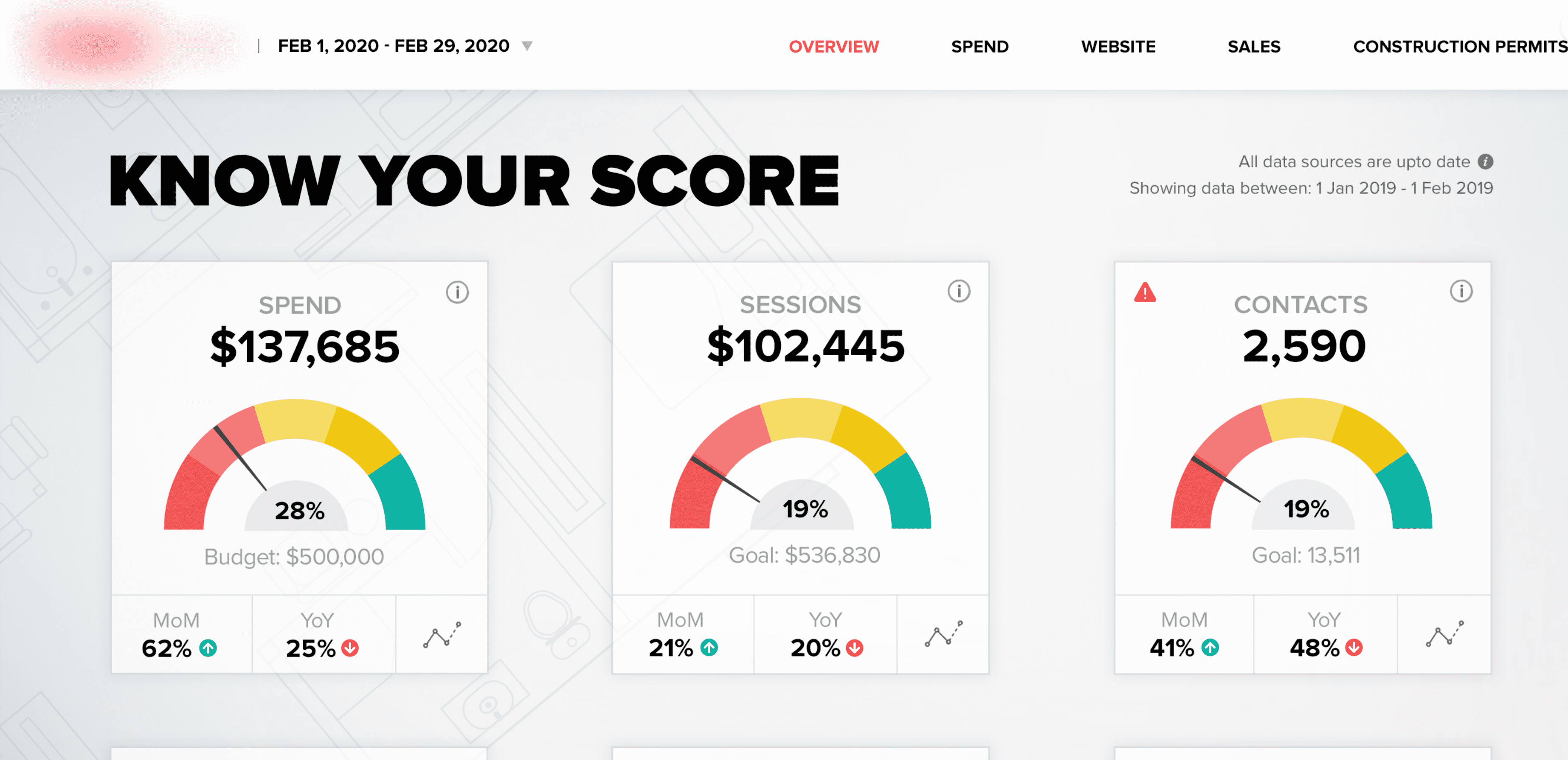
With Decision Foundry, you’ll receive intelligent data visualization, as seen above, and world-class support, ensuring you have an exceptional experience building your signature reporting platform. Take a look at our Datorama dashboard examples.
About Decision Foundry
Decision Foundry is a Salesforce, independent software vendor, managed services provider, and a certified award-winning Salesforce Marketing Cloud integration partner. Decision Foundry closes the gap between data accessibility, platform adoption and business impact. Our consulting services include the integration of Data Cloud, Account, Engagement, Personalization, Tableau, and Intelligence.


