Key Highlights
- Get rid of spreadsheets and use cool data visualizations to turn boring data into interesting stories.
- Learn how to choose the right chart for your data. You can pick from elegant line graphs, informative bar charts , or fun interactive maps .
- Find out the secrets of interactive dashboards . They let you explore data like never before.
- Equip yourself with top data visualization tools such as Tableau , Power BI , and D3.js Watch as your data comes to life.
The Art of Visual Impact
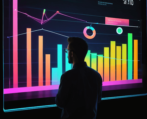
Data visualization transforms mundane spreadsheets into cool data visualizations that reveal compelling visual narratives. It goes beyond creating attractive displays, revealing the hidden value within datasets through thoughtful design and clear presentation. In an era overflowing with information, visualization helps surface crucial patterns and relationships that would otherwise remain buried in the numbers.
A powerful visualization draws viewers in, using color, scale, and composition to make complex big data digestible and meaningful. Through tools like Google Data Studio and Google Charts, we can now create dynamic, interactive visualizations that respond to live data visualizations, bringing information to life in ways that resonate with audiences and drive deeper understanding.
Boost Your Data Interpretation with These Cool Visualizations
Let’s explore how new visualization techniques bring data to life in unexpected ways. From tracking global health trends to mapping the depths of our oceans, each example reveals the power of transforming numbers into visual experiences that capture attention and drive understanding.
Through these visualizations, you’ll discover patterns in everything from internet traffic to music trends, climate change to NASA space exploration. Each example showcases the best data visualization examples from recent years and how thoughtful design can illuminate insights that numbers alone could never convey, inviting you to explore and uncover stories hidden within the data.
1. The Evolution of Internet Speeds Across the U.S.
A line graph reveals America’s digital transformation from dial-up to gigabit speeds. State-by-state trend lines climb across decades, with steeper curves marking technological leaps. Hover over any point to uncover precise speeds, while animated transitions between years highlight regional patterns of adoption and investment.
The visualization tells a deeper story through its layers of interaction. Compare rural and urban growth rates, spot infrastructure upgrades through sudden speed increases, and track the spread of new technologies. Color gradients present data that mark the shift from dial-up brown to broadband blue to fiber optic green, creating a rich visual history of how Americans connect.
2. Mapping the Most Influential Languages Worldwide
Discover global language patterns through an interactive choropleth map where colors tell stories of human communication. Deep reds might mark regions of language origin, while lighter shades trace paths of influence across continents. Zoom between global and regional views to reveal intricate patterns of linguistic diversity and cultural exchange.
Interactive elements transform raw data into exploration. Click on any region to reveal speaker populations and dialect variations. Timeline controls show language evolution across centuries, while overlaid heat maps highlight areas of rapid change or preservation. Each layer adds depth to our understanding of how languages shape communities and cross borders.

3. Visual Journey Through the Solar System’s Exploration
A force-directed network graph transforms space exploration into an elegant cosmic dance. Planets orbit as glowing nodes in this dynamic visualization, while mission paths weave between them like golden threads. Watch the network expand with each decade as humanity ventures further into the solar system.
Every element holds meaning: node size reflects exploration intensity, connection thickness shows data transmission volume, and color changes mark mission status. Click any path to reveal spacecraft journeys, or zoom out to grasp the full scope of human ambition. The visualization brings order to complex mission data while preserving the wonder of space exploration.
4. The Rise and Fall of Popular Music Genres
A bar chart race captures the pulse of popular music across decades. Genre bars slide up and down a popularity scale, their lengths morphing with each month of data. Bold colors distinguish musical styles while smooth animations reveal the dramatic shifts in cultural taste.
Beyond simple rankings, the visualization captures cultural moments. Watch genre bars react to technological disruption, from vinyl to digital streaming. Timeline markers highlight milestone releases, festival movements, and generation-defining performances, showcasing how we engage in different ways. The racing bars become a dynamic history of how we express ourselves through sound.
5. Global Climate Change: A Visual Story
Watch our warming world through an animated infographic where data becomes urgent storytelling. Rising temperatures paint across continents in deepening reds, while sea levels climb through blue gradients. Each frame reveals another year of change – glaciers retreat, storms intensify, droughts spread.
Click any element to dive deeper: explore carbon levels across centuries, witness accelerating ice melt, or track extreme weather events. The visualization strips away complexity to show climate change as it unfolds.

6. Understanding the Human Genome Through Data Art
Our genetic code bursts to life in a scatter plot – three billion base pairs transformed into a constellation of colored points. Each chromosome cluster tells its own story through distinct patterns and relationships, while genes pulse with activity data.
Beyond static display, this visualization invites exploration. Zoom from broad genetic patterns to individual sequences, watching as disease markers light up and protein pathways connect.
7. The Digital Economy: E-Commerce Growth Trends
E-commerce evolution flows through intersecting lines of a multi-layer line graph, each curve tracking a different market sector. Holiday spikes and pandemic surges create dramatic peaks, while mobile shopping’s rise draws an ever-steepening curve.
Regional filters paint a global picture: Asia’s early adoption, North America’s steady climb, emerging markets’ sudden jumps. The visualization captures both smooth transitions and disruptive leaps.
8. Visualizing the World’s Water Crisis
A sobering story emerges through this distribution heat map of global water access, as highlighted by The Guardian. Abundance shows in cooling blues across water-rich regions, while crisis areas burn in deepening reds. Population markers pulse with urgency where scarcity meets density.
Here, data visualization becomes a call to action. Zoom to community level to see individual stories, or pull back to grasp the global challenge. Each interaction reveals another facet of our world’s water crisis.
9. The Anatomy of Fortune 500 Companies
Segmented bar charts transform corporate data into visual storytelling. Each company appears as a multi-colored bar where segments represent key metrics: revenue glows blue at the base, workforce expands in green above, and R&D investment tops in purple. Bar width adjusts to market capitalization, creating an instant visual hierarchy of corporate influence.
Interactive features peel back layers of corporate strategy. Click any segment to reveal quarterly trends, filter by industry to spot sector patterns, or compare companies side by side. The visualization exposes relationships between investment choices and market success, turning complex financial data into actionable insights.
10. Pandemic Impact: A Data Visualization of Global Unemployment Rates
A multi-country line graph reveals economic shockwaves through rising unemployment curves. Each nation’s trajectory tells its own crisis story – sharp vertical climbs mark lockdown impacts, while recovery periods show as gentle descents. The graph provides a big picture view of the overall effects on different economies. Population-scaled line thickness adds depth, with darker hues indicating severity.
Beyond raw numbers, the visualization captures human resilience through data. Hover states expose policy responses: stimulus packages appear as stabilizing points, industry reopenings create downward trends. Compare regions to see how different approaches shaped recovery paths, including income per capita.
11. The Connectivity Era: Visualizing Internet Traffic Patterns
Digital traffic flows through a real-time network graph like neural impulses across a planetary brain. Major internet exchanges glow as central nodes, while data streams pulse between continents. Line thickness shows bandwidth usage; color shifts mark transmission speeds from sluggish reds to high-speed blues.
Split-screen views expose traffic patterns: email routes trace business hours around the globe, streaming services create predictable peaks, and social media activity ripples outward from viral events. This living map reveals our species’ digital interdependence.
12. Sports Analytics: Performance Data Visualization
Athletes’ movements paint stories across a dynamic heat map where data meets strategy. Shooting positions bloom in hot reds for high percentages, cool blues mark defensive weak spots. Player paths weave efficiency maps across the court, revealing optimal routes and contested zones.
Switch between quarters to see strategy evolution – defensive formations adapt, scoring patterns shift. Individual player views isolate performance metrics, while team overlays expose synergies and conflicts. Sport becomes science through visualization.
13. A Visual History of Nobel Prize Winners
The Nobel Prize is a well-known award that recognizes great work in many areas. To show the story of the amazing people who have received this prize, we need a tool that highlights their achievements over time. That tool is a timeline.
An interactive timeline captures a century of groundbreaking achievements. Each Nobel Prize appears as a node, expanding to reveal laureate details: breakthrough discoveries in physics, medical advances that transformed healthcare, literature that shaped cultural discourse, and peace efforts that changed nations. Following the tradition of Joseph Priestley’s pioneering Chart of Biography in Europe, this visualization brings history to life through data.
A complementary bar chart maps the geography of excellence, tracking prize distribution across countries and fields. Years appear on the horizontal axis, while stacked bars show category concentrations – revealing how quantum mechanics flourished in certain regions, or how literature prizes reflect global storytelling traditions.
14. Understanding Social Media Through Data Visuals
Social media is like a digital town square. It is a place for chats and connections. However, it is also filled with lots of data – a mix of talks, groups, and trends. Data visualization helps us make sense of this information by providing an overview of social media activity. It shows us what is happening in online social interactions.
A network graph transforms social media’s chaos into visible patterns. User profiles appear as nodes sized by influence, while connection lines trace relationships and information flow. A single node represents an individual user. Watch as viral content creates ripples, and community clusters form around shared interests.
Interaction patterns emerge through color and motion. Verified accounts pulse with activity, bot networks reveal suspicious patterns, and influence pathways show how information spreads. The visualization exposes both connection and division: tight-knit communities, bridging influencers, and the echo chambers that shape online discourse.
15. The Art of Cryptocurrency: A Graph Of Market Trends Visualization
Cryptocurrency is like the wild west of money today. Its changing nature and quick growth have made news and inspired many people. To make sense of this uncertain world, investors and fans focus a lot on studying market trends.
Line graphs are great for showing this ups and downs. Think about a chart that shows how prices change for Bitcoin, Ethereum, or Dogecoin. Each rise and fall shares a story – it could be about a new rule, a tweet from Elon Musk, or how investors are feeling.
These charts are not just for expert investors; they give everyone a chance to see the ups and downs of cryptocurrency. Get ready, it’s going to be an exciting ride!
16. Tech Trends: The Growth of Artificial Intelligence
Track artificial intelligence funding through a cascade bar chart where investment categories stack and flow. Research spending forms the foundation in steady blues, while venture capital adds volatile peaks in energetic reds. Each tier reveals industry focus: machine learning, robotics, natural language processing.
Timeline controls expose AI’s evolution from academic curiosity to industrial revolution. Filter by region to spot innovation hubs, or trace how breakthroughs trigger investment cascades across sectors.
17. Healthcare at a Glance: Visualizing Diet Patterns Around the World
Cultural eating patterns spiral through a radial distribution chart where distance from center shows consumption intensity. Traditional diets appear as balanced shapes, while modern transitions create sharp spikes in processed food rays.
Toggle between regions to see health implications: Mediterranean balance versus fast-food dominance, agricultural traditions versus industrialized eating. Each chart rotation reveals another facet of global nutrition evolution.
18. The World of Books: Analyzing Publishing Trends
Books flow like literary currents in this stream graph of publishing trends. Genre streams widen and narrow through decades – fiction’s steady blue current, textbooks’ predictable green tide, poetry’s thin but persistent silver thread. Each layer tells its own story of cultural appetite.
Market disruptions create dramatic shifts in the flow. Digital publishing carves new channels, audiobooks surge unexpectedly, while self-publishing platforms transform the landscape. Click any stream to explore bestseller impact, price trends, and format wars.
Data to Decision-Making
Visual data has revolutionized how we understand complex systems and make critical decisions. Leading organizations harness scatter plots to predict market shifts, while researchers use interactive maps to tackle global challenges. These tools don’t just display information—they reveal insights that drive innovation and shape strategy.
Yet visualization’s true power lies in its ability to democratize data analysis. When designed thoughtfully, visual patterns emerge that transcend technical expertise, allowing everyone from scientists to citizens to participate in evidence-based discovery. In our data-rich future, the ability to create meaningful visual narratives won’t just be valuable—it will be essential for solving tomorrow’s challenges.
Frequently Asked Questions
What Are the Key Components of an Effective Data Visualization?
Good data visualization is a good example of mixing clarity and graphic design well. It is not just about showing stats. It creates a story, using visuals to bring out important ideas and connect with people. Whether you are making an infographic or a detailed chart, clarity is very important.
How Can A Novice Creator Get Started with Data Visualization?
Are you ready to jump into the world of data viz? You don’t need to be a pro to get started. Tools like Tableau make it easy to begin. You can start by looking at tutorials. Try out different types of charts to see what you like. Let your creativity shine as a data creator!
Which Tools Are Essential for Creating Engaging Data Visualizations?
Creating interesting visuals does not need a magic wand – it needs the right tools! You can use big names like Tableau and Power BI, or flexible tools like D3.js. Even basic spreadsheets can work well. The important thing is to pick tools that match your skills and the kind of graphics you want to make.
How Does Data Visualization Facilitate Better Business Decisions?
In business, knowledge means power. Data analytics, along with good visualizations, gives decision-makers important insights. These insights help them handle tricky challenges. Visual data, especially through interactive data visualization, makes things clearer. It shows trends, patterns, and outliers that we might not see otherwise. Interactive visualization keeps users focused. This way, businesses can make better decisions that are smart and informed.


